| Contents | 1 | 2 | 3 | 4 | 5 | 6 | 7 | 8 | 9 | 10 | 11 | 12 | 13 | 14 | 15 | 16 | 17 | 18 | 19 | 20 | 21 | 22 | Previous | Next |
| 9. Report Items |
|
In the next sections we will review how to make changes to these reports, create your own reports, create your own reporting groups, make new formulas, sort the data, and export the data to an Excel worksheet.
|
| "Report Item" Menu Bar | Top |
|
The "Report Item" menu bar allows a variety of options to be applied to or against the current report or "Report Item". The standard "Report Item" Menu Bar is shown below:
There is also a matrix Report Item Menu Bar. If, when running the report from the main screen, you choose “Plot Elements” or “Plot Groups”, the Menu Bar for the Report Item looks a little different:
The standard Report Item contains a “Threshold”, “Drill”, and a “Plugin” choice, the matrix Report Item does not. The matrix Report Item contains a “Formula” and “Raw Peg” menu choice, and the standard Report Item does not. These menu choices are explained below. |
| File Menu | Top |
|
This menu allows you to a) print, b) export data in a variety of formats, and c) exit/destroy the "Report Item".
Print – This will take you to your typical printer setup screen. Exit – quits the graph item (not the CROME application) Export MenuExport – Exports Data to Microsoft Excel and other applications. Select “File” then “Export”. In this window you have the option of selecting the following items to export: ·
Result Set - The actual results of the formulas applied
to the data. Selecting this choice will
trigger Microsoft Excel to startup on your computer, showing the Result Set in
the spreadsheet. ·
Raw Data Set - The raw data queried from your selected
report. Selecting this choice will
trigger Microsoft Excel to startup on your computer, showing the Result Set in
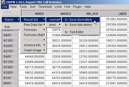
the spreadsheet · Formulas - The hierarchical representation (as entered in the Formula editor) of the formulas used to satisfy the selected report. This is sent to the default text editor as configured on your PC (usually Notepad or Write). · Formulas (flat) - The flat representation (showing the lowest level database pegs) of the formulas used to satisfy the selected report. If there are no “formulas within formulas” in your report definition, then “Formulas (flat)” is the same as “Formulas”. This is sent to the default text editor as configured on your PC (usually Notepad or Write). · Migration Info – If this report is run at a network level for which element migration tracking is performed, then this command will export (to a text editor, e.g., Notepad) the migration info (for example, “BTS XYZ moved from BSC 1 to BSC 2 and later renamed to BTS ABC”) · Graph Image – This exports a Gif image of the Report Graph to whichever application is registered to open Gifs on your PC (typically either the default Windows picture viewer, or Internet Explorer). Below a File - "Export - Result Set - normal - to: Excel (formatted)" export menu is displayed
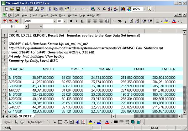
The next image shows the exported data and the report information. The data may be easier to manipulate in the “Excel” workbook format in particular if you plan to publish and distribute a formal report. You could also write Excel-macros to take this data and populate another “Master” workbook setup, which includes your company’s header and formatted columns. Your report is then ready for distribution. Refer to "Report Export Functions" for more details.
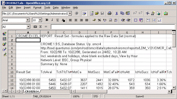
Alternatively, CROME can also export data to other applications such as Sun Microsystems's free multi platform StarOffice application suite (or the OpenOffice package the non-Sun public development version of Sun's StarOffice) or gnumeric, typically found in Linux distributions:
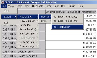
Note the other selection "Export - Result Set - normal - to: Text Editor" would send the data to a standard editor like notepad or wordpad on a PC or vi, vim, kedit etc. on a UNIX/LINUX host:
The other exportable items, Formulas, Formulas (flat), Query, etc. will simply export what is in the "View" drop down menu to a text editor. |
| View Menu | Top |
|
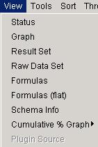
This menu allows you toggle in and out of the following displays inherent in an actual report or "Report Item". View – Within this window you can toggle in and out of the following areas:
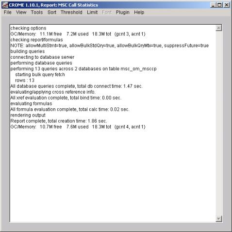
View StatusIf you select Status – the "Report Item" shows you the process/progress window displayed while the Report or Graph is being run.
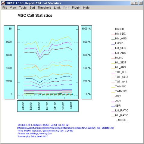
View GraphToggle the “View” again and this time select “Graph”
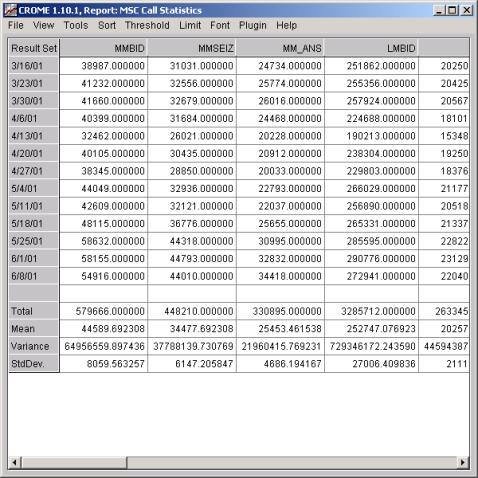
View Result SetToggle the “View” again and this time select “Result Set”. This view is your spreadsheet format displaying the field names along with the results calculated from the formulas.
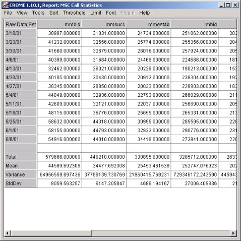
View Raw Data SetToggle “View” again and this time select “Raw Data Set”. This displays the raw data pegs used to make the formula results shown above in the “Result Set” spreadsheet.
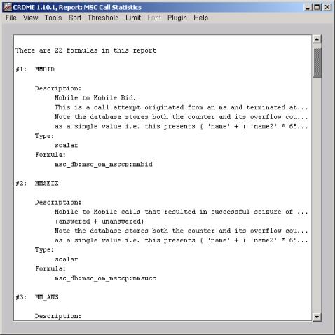
Now that you have seen the “Raw Data” and the “Results Sets”, you may “Export” either item shown in the grid via the "File - Export" drop down menu. In Excel you will have detailed control over the visual appearance of the reports final presentation and publication. View FormulasToggle the “View” again and this time select “Formula”. This view displays the formulas used to make the fields displayed in the Graph and Result Set.
As displayed in the image above the "MSC Call Statistics" report uses 22 formulas, and you can scroll up and down to view each of the formula. If a busy hour is used to create the "Report Item", the information on how the busy hour was constructed will also be shown at the beginning. The display gives you the formula name, a description if one is available, the type (scalar or ratio), the counters used along with the mathematical tools. View Formulas FlatToggle the “View” again and this time select “Formula (flat)”.
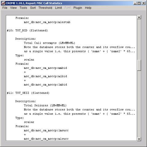
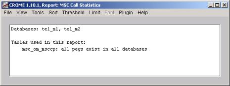
This view displays the formulas flattened to the lowest level, i.e. the raw pegs or statistical items used to make the fields displayed in the Graph and Result Set. This view might be much larger than “Formula" because all hierarchy (i.e. formulas of formulas are flattened). If there are no “formulas within formulas” in your report definition, then “Formulas (flat)” is the same as “Formulas”. Toggle the “View” again and this time select “Schema Info”. This view displays the degree of homogeneity of the data sources. Remember that CROME will run correctly reports on non-homogeneous data sources, i.e., if switch or network element releases are out of sync.
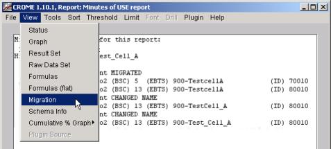
View MigrationIf the system property for “Show Migrated Elements” is turned ON (see Properties described later in this document), then the “View” menu on the report will also show a choice for “Migration”. A drawback of other PM systems is the inability to track when a network element has migrated from, say, one BSC to another, or to track a name change in an element name and still determine that it is indeed the same element. CROME solves these problems by performing some intricate migration and name-change detection algorithms. When the migration feature is enabled, CROME will consolidate identical elements below the BSC level that may appear different but are really the same. In the example shown below, a site called “900-TestcellA” was moved from BSC 5 to BSC 13. A new network ID was assigned by the system, however CROME detected that the names were the same and thus consolidated the information. Note that the name “900-TestcellA” was renamed to “900-TestCell_A” and then again to “900-Test_Cell_A”. Nevertheless, CROME still considers this as one element, and if this report was View-by-element then you would only see this one item (and if Show Migrated Elements was disabled, you would incorrectly see all of these sites separately). The report itself (the Graph and the Grid) will reflect the detected migrations, and the “Migration” choice in the “View” menu simply shows you the logic train traveled to determine the migrations involved, if any.
|
| Tools / Report Editor – Change a “Live” Report | Top |
|
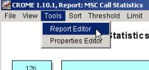
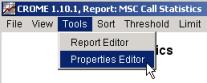
The "Tools Menu" allows you to adjust the look and feel of various displayable characteristics in your "Report Item" and when configured for a supported PM environment launch "plug-ins" such as GIS displays. Select “View Graph” to return to the Graph and this time select “Tools”. Under this header you can choose from Report Editor or Properties Editor. Select Report Editor for editing the report.
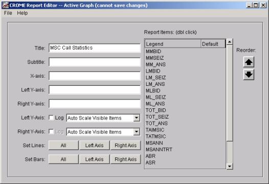
The Report Editor is a powerful tool for creating and modifying report definitions. From the Main CROME screen you can select New Report or Edit Report to create/modify a report. When you are running a Report Item and you select Tools – Report Editor, you are also launching a Report Editor, but this time on the “live” graph. The changes you make in this mode do not effect the saved Report definition (as it does when you select Edit Report from the Main Screen) but instead it allows you to change the look and feel of the graph you have just generated. Once you “Exit” this Report Item, the changes made using Edit Report go away – they are not saved. Documentation in this section will be similar to the section on the Report Editor, except the displays look slightly different here – since this is a “live” Report Item, certain features are not available that are available when editing/saving the actual report definition. Through the Tools / Report Editor feature you change all titles and legend names, reorder the fields, change whether or not the data is plotted in Log or Linear form, or change whether or not you are viewing “lines” or “bars” on the graph. Remember that any changes made to this editor only apply at this time, they are not permanent changes. We will review making permanent changes in detail later in Report Editing.
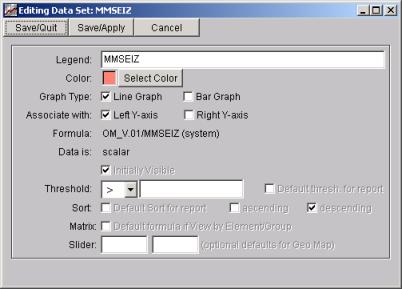
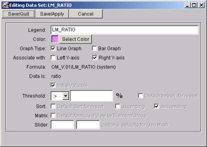
The right portion of the screen shows the formulas that are plotted on your graph. By double-clicking on one of the formulas, you can change particular attributes of how that formula is represented in the graph: You can make individual changes for each field, change Axis, or select a new color, change the Bar Graph to a Line Graph, or change the Left Y-axis to the Right Y-axis, adding a threshold value, and sorting criteria.
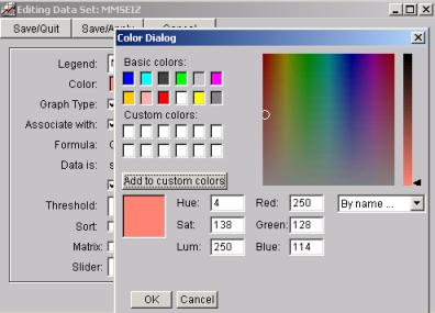
In the example below, you can change the color for any formula on the graph:
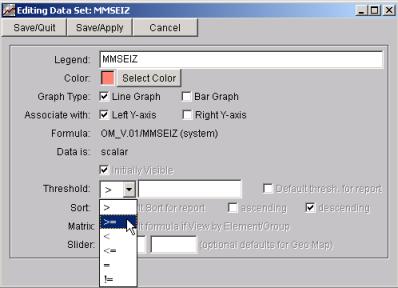
Setting Thresholds on Report Items: The text and pictures below discuss changing thresholds on live Report Items. Note that the formulas that are a “Ratio” will have a percentage (%) symbol for the “Threshold” value.
Note that many fields on the bottom half of the above image are “grayed” out. When creating/editing a report for future use (see the section on the Report Editor), these fields are available, as they relate to issues only pertinent to launching a report (i.e., what is the default threshold/sort when the report is first launched, etc.). When manipulating a “live” Report Item, these fields are not applicable and hence are grayed out. However, you can change the Threshold value on a live Report Item, and this will actively change the report you are viewing. I.e., if you enter “Threshold > 500” then click Save/Quit or Save/Apply, your Report Item will update and only show items where this formulas has a value greater than 500. Save/Quit will save the changes and quit the editor. Save/Apply will make the changes but not quit the editor so you can view your changes before quitting the editor. Cancel: cancels your edits completely. Changing the Y-Axis
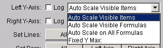
Scale This screen also allows you to actively change the Y-Axis scales. Like most features in this interactive editor, the Y-Axis Scale can be changed on-the-fly and also changed in the report definition to establish the default Y-Axis Scale. To alter the axis, use the “Auto Scale” feature for either axis on the Report Editor screen. Left Y-Axis “Auto Scale” and Right Y-Axis “Auto Scale” choices:
The Left and Right Y-axis scales can be configured separately. In their default mode (“Auto Scale Visible Items”) the graph auto-scales for you, so there is no need to adjust these scale choices unless you want to modify the way in which the graph is scaled. Note that each formula in the report is “associated” with an axis. If all formulas are configured for the Left Y-Axis, then adjusting the scaling for the Right Y-Axis will have no effect on the graph (and vise versa). It only has an impact if there are formulas associated with that scale. For each axis, there are four ways to configure the “scale” of the each Y-Axis. The first three choices are different ways to have CROME “auto-scale” the graph, and the last choices allows a fixed scaling: Auto Scale Visible
Items This is the default setting, and it means to allow CROME to auto-scale the Y-Axis based on the items currently shown on the graph. This means that if you use the “Limit” feature to limit to, say, the first 10 items on the graph, then the graph will auto-scale to only those 10 items. Also, if you actively hide formulas from your graph, the graph will re-scale based upon only the visible formulas. This setting will always give you the best picture for graph, because the scale closely matches the items on the graph. Auto Scale Visible
Formulas If you actively hide formulas from your graph, the graph will re-scale based upon only the visible formulas. But unlike “Auto Scale Visible Items”, the scale will not change if you “limit” to, say, the first 5 items. This has an advantage over the previous setting in that you can compare differently “limited” results against each other using the same Y-Axis scale. Auto Scale All
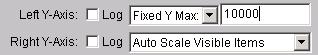
Formulas With this method, CROME determines the Y-Axis scale based on all values of all formulas in the report. This scale will not change, even if you “limit” the number of items or number of formulas displayed. Fixed Y Max
|
| Tools / Properties Editor | Top |
|
Exit out of “Report Editor” and select “Properties Editor” this time.
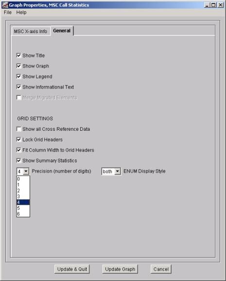
The Properties Editor used to configure the individual reports can contain two tabs: the " X-axis Info" which is only present for view by element type reports (his will be covered in a later section) and the General Tab which is always present this will be covered next: Properties Editor / GeneralThe Properties Editor can be launched from the Main Screen (Under the File menu), and when doing so you are configuring the properties of all future reports. When you launch the Properties Editor from a Report Item, you are only changing the properties of this one report. For this reason, some options are grayed-out in the Report Item Properties Editor, but are available in the Main Screen properties editor (for example, see Merge Migrated Elements below). Show Title: the title will appear at the top of the graph. Show Graph: then the graph will be shown. Show Legend: the legend description on the right will be displayed. Show Information Text: displays the Information at the Footer of the graph. Merge Migrated Elements: this will track the “Elements” as they migrated from under different higher level “Elements” across time or undergo name changes across time. This is typically used for site names only. Note that since we have this item is “grayed-out” when launching the Properties Editor from a Report Item, because the report has already been run and you cannot re-migrate after the fact. To change the behavior of whether or not to track migrated elements, launch the Properties Editor from the main CROME screen (under the File menu), check or uncheck Merge Migrated Elements, and then run the report again.
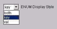
Grid Settings Show all Cross Reference Data: will display the value for each Network Element, as well as the x-axis label. Lock Grid Headers: the column headers for “Result Set” and “Raw Data” will not scroll off the screen. Similar to “Freeze Panes” in Excel. Fit Column Width to Grid Headers: the Headers to the column will fit in the column. Show Summary Statistics: the report will display the summary statistics at the bottom of the report. Precision (number of digits): sets for the entire report the number of place holders for values shown. ENUM Display Style: CROME pegs can be configured as enumerated type (e.g., “1” represents “success’ and “2” represents “failure”. Any peg can be configured with arbitrary enumerated “keys” and “values”. When viewing CROME reports, you can choose whether or not you want to see the numeric “key” or the text-based value, or both:
Select the “Update Graph” button for changes made, and “Cancel” button to exit out of this window. |
| Sort Menu | Top |
|
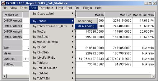
The CROME client allows filtering of data via the three operations: sort, threshold, and limit. These filters can help hide data that is unimportant and ease the job of a data analyst. In all cases the items are built dynamically from the Report definition and presented in menus to the end user. The user may interact with a live graph and define new thresholds, however such work made outside of the report editor can not be saved. Exit the Properties Editor, and select “Sort”.
In the window below is the original output for this report.
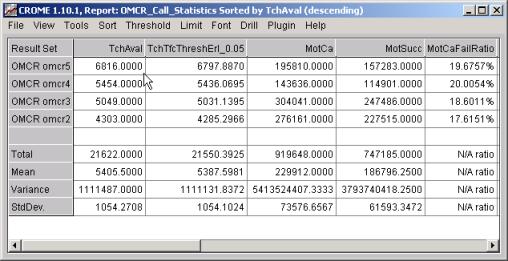
In this window is the result of the sort shown above. The results for TchAval have been sorted in descending order.
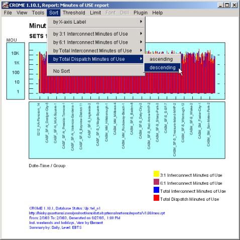
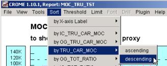
The examples below are all showing “Graph” views, but you can also do these same “Sorts” using the “Result Sets” and the “Raw Data Set”. In this window I’ll select the field “Total Dispatch Minutes of Use” and sort in “descending” order.
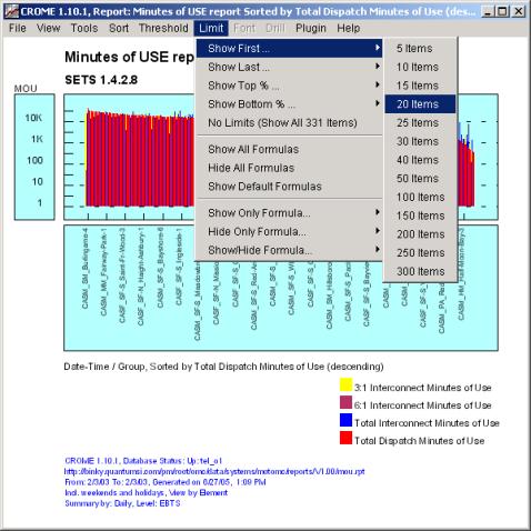
Now that you have sorted the Dispatch Minutes of Use, let’s say you only want to see the sites with the highest or lowest minutes. Select “Limit” and select the number of items you wish to display.
|
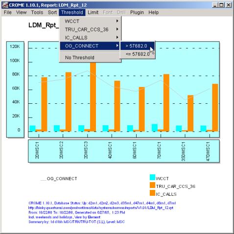
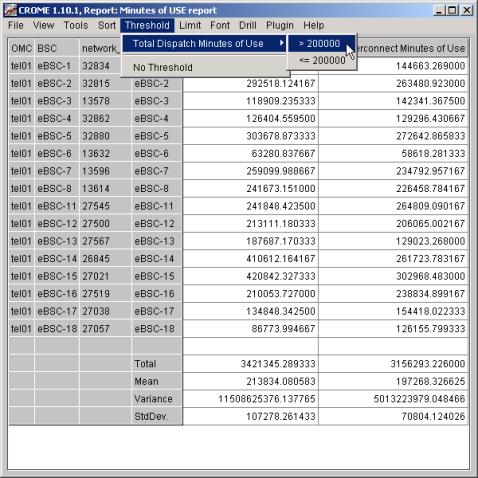
| Thresholds | Top |
Threshold MenuThe second style of filtering of data in a CROME Report Item is threshold definition and manipulation. You can select Threshold and change the current threshold (if any). The thresholds are defined in the Report Editor (see above), and the graph initially appears with the “Default Threshold” of the report, if any. To modify the threshold on the fly, simply pick one of the thresholds:
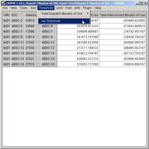
As with the graph, you can apply the threshold feature to the Result set or Raw data grids. Simply select the desired grid from the View menu file. If the Threshold feature was previously selected, the filter is automatically applied the grid, otherwise, select the desired threshold. You'll notice when any of the filter options are selected, the statistic summary is not displayed at the bottom of the grids. You will also see the status of your filter selections displayed on the title bar of the window
Removing both the threshold and limit filters will display the statistic summary at the bottom of the grids.
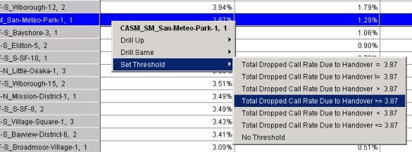
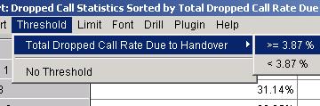
The possibilities are endless. You can pick any combination of sorts, thresholds, and limits to help focus the query. A key feature of CROME is that any report template can be applied, without changing to many different reporting periods, granularities and filters. Set Threshold Popup Menu (Dynamic Threshold)Another way to add a threshold to your report is to right-mouse-click on an item in the Grid and select a Dynamic Threshold. In the following example, we right-mouse-click on the value 3.87%, in the row representing Site CASM_SM_San-Meteo-Park, Sector 1, and the column of Total Dropped Call Rate Due to Handover. After clicking on it, we get a popup menu that includes “Set Threshold” menu and several possible options:
In this example we choose Total Dropped Call Rate Due to Handover >= 3.87. This will add the threshold to the active Report Item and apply the threshold, thus showing only those rows whose Total Dropped Call Rate Due to Handover is greater than or equal to 3.87. You can disable this threshold by selecting any item in the same fashion and choosing No Threshold, or by choosing No Threshold from the Threshold menu at the top of the Report Item window. This “dynamic threshold” action is the same as taking the longer steps of launching the active Report Editor and typing in the threshold manually. In either case, creating a new threshold will add a new item to the Threshold Menu for this Report Item, e.g., after the action shown in the above picture, the Threshold Menu will now contain this threshold:
The threshold is only added to this active Report Item, and disappears after you quit this report. It is not stored permanently with the Report definition. Also note that threshold features can also be accomplished in a completely different (and advanced) method of changing the database query before the report is run. This features is described later in the document: Query Filtering. |
| Limit Menu (Top N items) | Top |
|
The third style of filtering of data in a CROME "Report Item" is limit definition and manipulation. You can also select Limit and change the number of items displayed. To modify the limit on the fly, simply pick one of the limits:
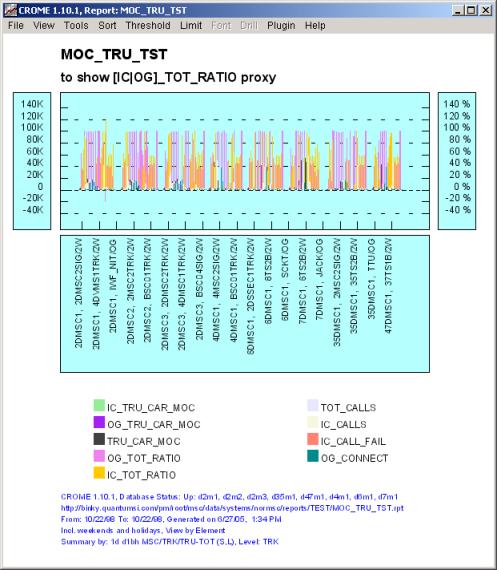
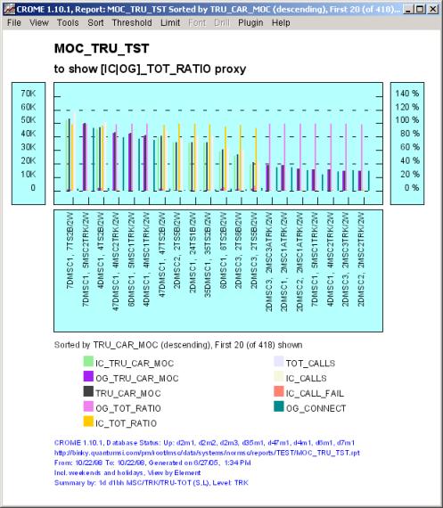
The above image is sorted by an equation which represents Erlangs, however there are over 400 trunk groups displayed, assuming that only the busiest trunk groups need be displayed the live graph item can be viewed by applying a limit filter. By sorting the data and then applying a limit, the data can be visualized much easier.
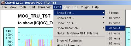
Resulting in a graph that looks like:
The same graph with a limit of 20 applied is now easy to read and only shows those trunks carrying the highest traffic. The ability to limit by first or last coupled with ascending or descending sorts can be used to make the traditional "TOP N" or "BOTTOM N" reports like Top 10 or Bottom 5. In fact such filters (i.e. combinations of sort, limit and/or thresh hold) can be bound to a report to automate the entire process for scripted GIF images and input into a fault management systems such as NetExpert engine or a NetCool system. Just as with the graph, applying the limit feature to a grid allows the data to be viewed easily. You'll notice anytime the threshold or limit features are applied, the statistic summary is not displayed at the bottom of the grids. By removing the filters, you'll be able to view the statistic data again. |
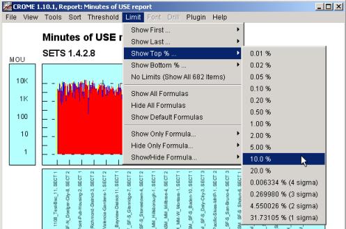
| Limit Menu (Top %) | Top |
|
As well as limiting by a specific number of items (as shown above), you can limit by percentages (e.g., show the top 10%):
|
| Limit Menu – Limit Formulas | Top |
|
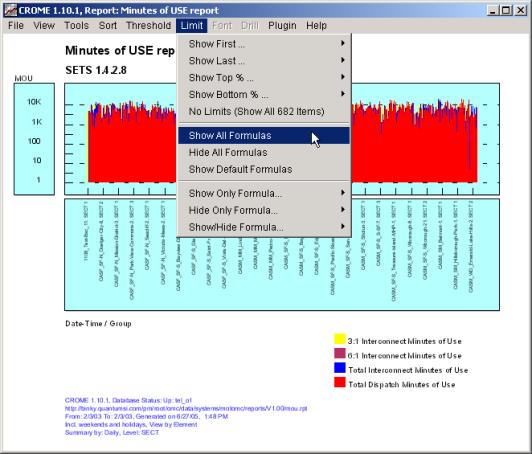
As well as limiting the number of items within each formula, as shown above, you can also limit which formulas are displayed. For example, your report may contain 5 formulas, but after bringing up the graph or the grid you may want to focus no just one of those formulas. With the “Limit Formulas” feature, you can hide/display any of the report’s formulas. You can also predefine which formulas are visible or hidden by default, and then after running the report you can show/hide any of them. To modify the visible formulas on a report, use the Limit Menu:
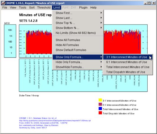
The top three choices on the Limit menu were described in the previous section – they allow you to limit the number of items displayed for each formula. The next six choices allow you to limit which formulas are displayed. Of these six “Formula” choices, the first three show or hide sets of formulas: Show All Formulas Makes visible every formula defined in the report Hide All Formulas Makes invisible every formula defined in the report Show Default Formulas Makes visible every formula that was defined as “initially visible” in the report. By default, all formulas are initially visible unless specifically made invisible (see section on Report Editor for more info). The next three allow you to pick from specific formulas: Show Only Formula Makes visible the selected formula and hides all others:
Hide Only Formula Makes invisible the selected formula and makes visible all others:
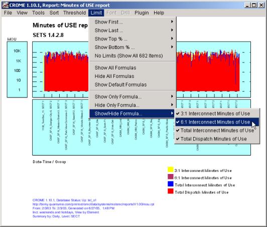
Show/Hide Formula In this menu, each formula can have a “check mark” next to it. If the formula is “checked”, then it is currently being displayed. If it is “unchecked” then it is currently hidden. Choosing a formula from this menu toggles this state. I.e., if the formula is currently checked, selecting this formula will hide it. If it is currently unchecked, selecting this formula will make it visible. This selection only affects the selected formula – the other formulas will remain in their previous state.
|
| Font Menu and Selection | Top |
|
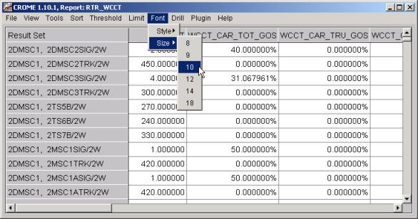
You can also alter the font and the size used in the grid displays. Though changing the font features will have no effect on the live graph as the fonts are automatically calculated. Also this feature applies only to the Result set and Raw data grids and no other types of view. Typically changing the fonts is a user preference when viewing lots of data or when working on a screen with small resolutions. To modify the grid's font and point size on the fly, simply select one of the items under the Font menu:
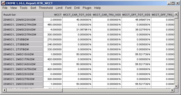
In the example below, changing the font size from 14 to 10 displays more data items on the user screen:
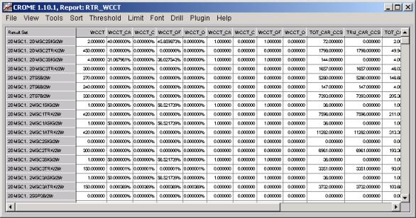
Next we reduce the font still more to a point size of 8, and using the "Tools/Properties Editor" we make the column widths based on the data columns (white area) rather than the data headers (the first gray row).
|
| Drill Menu and Drill Pop-Ups | Top |
|
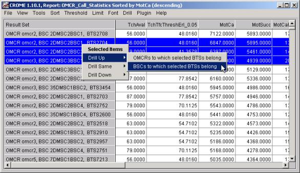
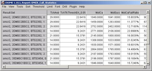
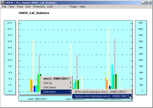
One of CROME’s unique powers is to visualize reporting in terms of a hierarchy of network elements. To further make use of this power, CROME allows you to “Drill” any report to look at the same data at lower or higher levels in the network hierarchy (or even at the same level but by isolating any elements in the report). This capability enables the engineer searching for issues to quickly uncover problems and analyze related elements for the same issue or variance. To make use of Drilling, you must first run your report in View by Element mode, because it is the elements in the report that are “drillable”. Any item can be "drilled" by simply right-mouse clicking its location on a graph or by right-mouse clicking its line in the grid. Simply click on the item to drill and a “pop-up” menu will appear with various drilling choices. Also, when looking at the data in the “grid” mode, any number of items can be "grouped" together (using the Shift or Ctrl key in the same manner as normal Microsoft applications) and then the "drill" will take place on the selected items. As well as right-mouse-clicking on an item or set of items, you can choose “Drill” from the menu at the top of the screen, which drills on all selected items in the grid. The "Drilling" capability works in three distinct modes (all of which instantly run new reports at different hierarchical focus or element groupings). Drill UpThe "drill up" mode takes into account "parents" of the selected network element(s) and shifts the hierarchical view to the parent level selected. Any element or set of elements can be highlighted and then “drilled”. For example three elements are highlighted in the below "Report Item" and a "Drill Up" operation is selected to show the BSCs to which selected BTSs belong.
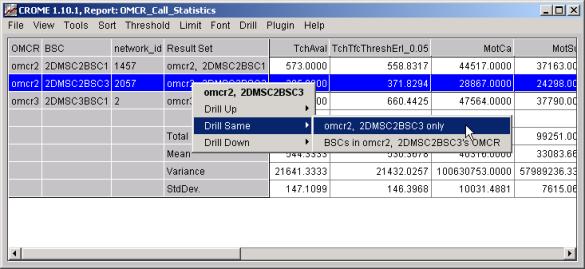
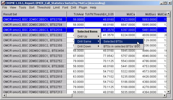
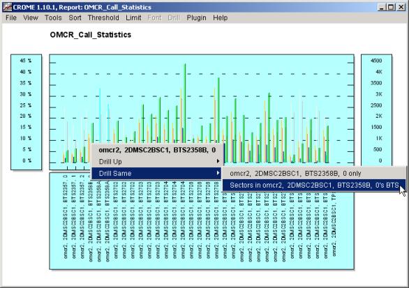
This will trigger a new report to run for only those Drill SameThe "drill same" allows you quickly pick one or more elements on the report and then run the same report, at the same level, but only include the selected elements, removing the rest.
Another power feature on the Drill Same menu is to see all elements at this level that share the same parent as the selected item(s) (e.g., “show meall the BTS e.g. sites in this site's BSC -o- in the imagae below the parent BSCs of the selected set of sites).
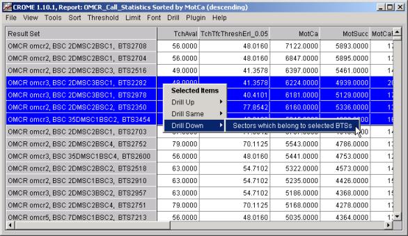
Drill DownThe "drill down” mode let’s you quickly see the value of the child elements of the selected item(s). So, for example, if a problem appears in an site (i.e. BTS), the issue can be quickly be analyzed down at the Sector level for only those Sectors in a single site or a set of sites.
The result of the previous drill down request is shown below:
Drill Operations on a GraphAll the prvious "Drill" operations shown in the "grid" mode are also available from the "graph" view of a CROME "Report Item". However unlike the "gird" mode (i.e. "result set" or "raw data" views) only one item can be selected at for a given "drill" operation in the graph view.
The resulting graph is shown below, with yet another "Drill" operation about to be invoked:
|
| Additional Menu features in Matrix Report | Top |
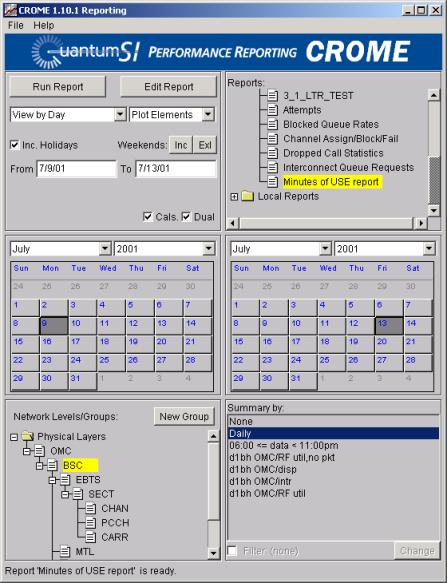
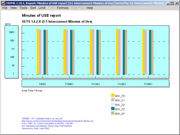
Matrix ReportIf you choose “Plot Elements” or “Plot Groups” from the main CROME screen, you are running a “Matrix Report”, which has different features from a standard CROME report. In a Matrix Report, the graph compares different network elements (or groups of elements) against each other, as opposed to normal CROME report that compare formulas against each other.
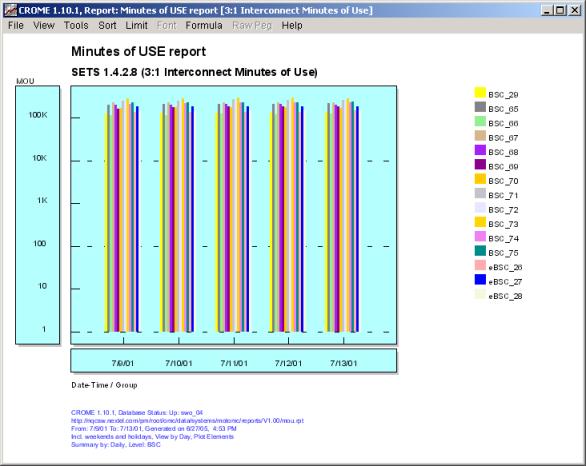
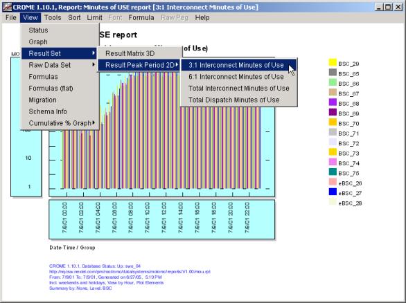
Since the graph and grid shows a comparison of network elements over time, it can logically only show one formula on a particular matrix report. Since a single CROME report definition can contain multiple formulas, the matrix report contains an additional menu choice: “Formula”. This menu allows you to switch the display between the different formulas in the report. As an example, let’s set up our main screen as above i.e. select the following criteria (the time values and actual elements returned will be different from your system, of course): · System Type: OMC · View by: Day · Plot: Elements · Report Name: Minutes of Use · Physical Layer: BSC · Summary by: Daily Running this report, you’ll see the following graph, showing the value of each BSC for each day for the first formula in the report definition ("3:1 Interconnect Minutes of Use", as noted by the new subtitle). The formula name is also in the blue title bar.
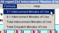
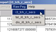
You’ll notice that, since this is a Matrix Report, you have two new menu items: “Formula” and “Raw Peg”. “Raw Peg” is currently gray and disabled – it will become enabled when you switch the display to “View Raw Data” (see below). Let’s look at the Formula menu:
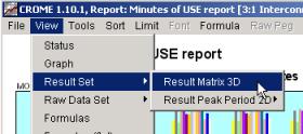
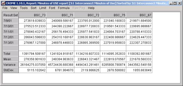
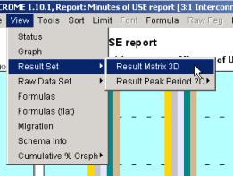
Since there are 4 formulas in this report definition, you can switch between the different formulas by the new "Formula" menu option on top of the graph. For example, in this report, we have 4 formulas to choose from. By choosing a different formula, the graph will update the bars/lines to represent the values of that formula (for the same dates and BSCs). Now if you choose “View / Result Set / Result Matrix 3D”
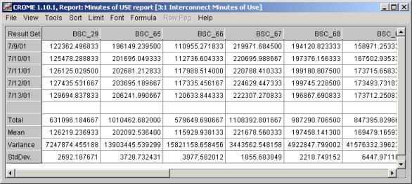
you will see columns of BSCs and rows of days, showing the value of the first formula in the report
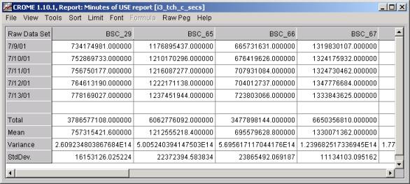
The Result Set grid in Matrix Reports show the Elements at the top of the screen, representing the data for each column. Just like in the graph, if you switch formulas via the Formula menu choice, the data in the grid will change to represent that formula, and the title bar at the top of the graph will change to reflect the formula name. Raw Data Menu– Matrix ReportNow if you choose “View / Raw Data Set / Raw Matrix 3D”, you’ll see:
The data on this screen shows the values for the first raw peg in the query, broken down in the same manner: rows of dates and columns of BSCs. Just like switching between formulas, you can now switch between the different raw database pegs queried and see the value per element per day. Notice that when you switched to view "Raw Data" the "Formula" menu became gray and disabled, and the "Raw Peg" menu became enabled. By changing the Raw Peg viewed via this menu, you can see the value for each raw peg, per element per day.
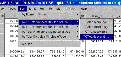
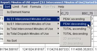
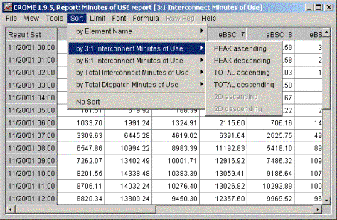
Sort Menu – Matrix ReportThe Sort feature in Matrix Report works slightly differently than in normal reports. The purpose of sorting in CROME is to help isolate problem network elements (e.g., Sectors, EBTS, BSC, etc.). In normal, non-matrix CROME reports, when viewing by element, the x-axis (and consequently the rows of the grid) show network elements, and hence when sorting it makes sense to re-arrange the x-axis (and hence re-arrange the grid rows) when sorting. In Matrix Reports, the network elements are instead represented as different bars on the graph (or lines), and hence the different columns on the grid. Therefore, it makes sense in Matrix Report to sort the bar/lines on the graph (and the columns on grid), instead of x-axis/row sorting. So, in this example, view the "Result Set" and make sure you are viewing the "3:1 Interconnect Minutes of Use" (via the Formula menu – see the picture above). Now choose Sort and select "by 3:1 Interconnect Minutes of Use" and then "TOTAL descending".
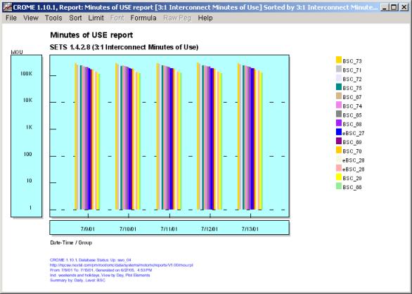
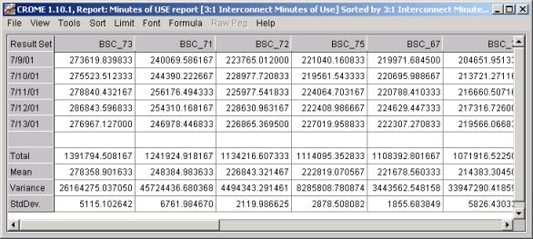
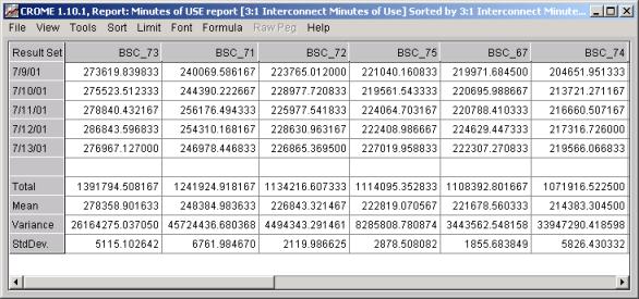
You will notice that the rows stayed the same (4/3/00 thru 4/7/00) but the BSCs have reshuffled in the order of greatest Total 3:1 Interconnect Minutes of Use. BSC_57 has the highest, and BSC_62 has the lowest:
If you switch over the "View Graph" you will see that the Graph changed as well:
Again, unlike non-matrix reports, the x-axis (4/3/00 thru 4/7/00) remains the same, but the BSC list on the right side of the graph has now been re-ordered by Total 3:1 Interconnect Minutes of Use descending, and the associated bars on each day have re-ordered accordingly. Switch back the View "Result Set" and let’s look closer at the Sorting. Previously we sorted on "TOTAL descending" but there was also a choice for "PEAK descending".
PEAK descending means: order the elements based on which element had the highest value in ANY of the given time periods, instead of TOTAL which means order based on the total value for ALL time periods. So if we choose to sort on 3:1 Interconnect Minutes of Use PEAK Descending, the grid will now look like:
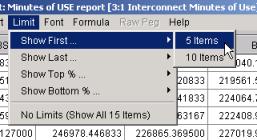
You’ll notice that BSCs stayed in the same order, since in general the busier BSCs had the highest peaks. But if, in this example, BSC_75’s maximum value over the 5 days was greater than BSC_72’s maximum value over the 5 days, then BSC_75 would be sorted ahead of BSC_72. Limit Menu – Matrix ReportSince the Sorting on Matrix reports works on the columns instead of the rows, it makes since that the Limiting work the same. For example, now that you’ve sorted the grid, you can click on the Limit menu and choose "Show First… 5 Items":
Instead of limiting the number of rows (or number of items on the x-axis of the graph) as CROME does in non-matrix reports, it will instead limit the number of columns (or lines/bars on the graph). In this case, only the 5 busiest BSCs would be shown:
and, of course, View Graph reflects the same change on the graph: only the first 5 BSCs:
Matrix Report – View Result Set and View Raw Data Set choicesThe Matrix Report has more pull-right features when viewing the information in Grid format. Whereas non-matrix reports allow you to “View Result Set” and “View Raw Data Set”, the matrix report has a menu that looks like:
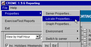
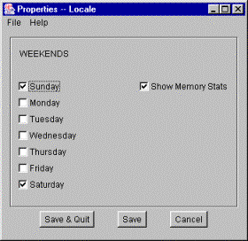
If you choose “Result Matrix 3D” then you will get the Matrix Report appearance as has been described in this section. If you choose of the pull-right options under Result Peak Period 2D, this allows you to view the data using a Bouncing Busy Hour on the Fly. This top is covered in a section below, Bouncing Busy Hour on the Fly. Matrix Report – Memory Consumption IssuesThe Matrix Report is a powerful new feature of CROME, but be forewarned that it provides, by its very nature, the ability to query much more detail and consequently many more individual data items than normal CROME reports. For this reason, large Matrix Report queries (for example, looking at several formulas at once over each hour in a day over all Sectors in all OMCs) can and will take longer to run that normal CROME reports. Further, they can consume a significant amount of RAM on your PC (possibly more than you have available to run the report). However, for nearly all practical uses of the Matrix Report, query-time and RAM consumption should not be an issue. Up until the CROME 1.8 Matrix Report feature, it was difficult for a CROME user to grab a great amount of data out of the CROME database and into the local PC application. This was because the data was always summarized over the entire requested time span, or summarized by all the requested elements. Now, however, with the advent of the Matrix Report, the user essentially has carte blanche to dump the entire database, row by row, column by column. The CROME database contains many, many gigabytes of data. With the Matrix Report, a user can easily formulate a request that is too RAM-intensive for the user’s PC to handle. In many cases, CROME can detect this and will automatically abort the report request if it is too RAM intensive. In other cases, the CROME application may just "hang" and not complete if too much RAM is being used. First off, it is important to note that the kinds of reports that would consume that much RAM are not too useful. For example, looking at a grid of every single sector across all 5 OMCs over an entire month period is not a very useful report. As an example in one CROME installation, there are currently approximately 2,500 sectors in all 5 Nextel Southwest Region OMCs, and viewing over 30 days would amount to 75,000 individual items of data. THEN multiply that by the number of formulas or raw pegs in the report, and you see how it can easily escalate to an incredible amount of data. When viewing matrix reports, it’s best to try to focus on what you are trying to get out of the report before formulating the report request. Analyzing OMCs, BSCs, and MSCs should never cause a problem, since there are so few of those. When running matrix reports at the EBTS and Sector level, consider possibly (1) limiting the time span of the query, (2) running on only the required servers (e.g., if just analyzing Tustin OMC, first switch your server via the File/Properties Menu to only focus on Tustin), (3) creating/analyzing on Groups of elements instead of the entire database (create your own Groups or use some of the provided Clusters). Enabling Memory StatisticsOne way to tell if your requested Matrix report requires too much RAM is to enable Memory Statistics. To do this, bring up the Locale Properties:
and check the box labeled "Show Memory Stats", and click Save (or Save & Quit).
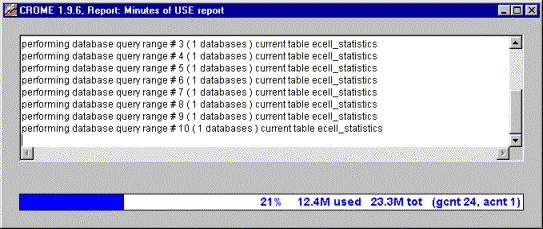
When the Show Memory Stats is enabled, the CROME reports will show the amount of memory used while the report is coming up:
There are two numbers shown: "tot" is the amount of memory, in megabytes, that CROME is currently consuming. So, for example, if you only have 64 Megabytes of RAM on your PC, the "tot" is greater than 64, your computer is "swapping" its memory to disk in order to finish this report. This can result in CROME running very slow (by 10-100x), and furthermore if your computer runs out of swap space on your then the report will not complete. The "used" statistic is the amount of memory, in megabytes, that CROME is currently using within the "tot" amount it has consumed. For example, it may be consuming a "tot" of 32 Megabytes on your PC, but at some point it may have "freed" 16 megabytes (say when you quit your last report), and therefore only "using" 16 of the 32. Unfortunately, a process on a PC (or on Unix) never shrinks in size: once it consumes 32 megabytes, even if it frees 16 of those, it will always take up 32 megabytes of RAM. If your "used" is lower than your "tot", it just means that if CROME has to grow further in size it will first consume the "tot" memory it has already allocated before it is forced to grow and consume more RAM on the computer. The default settings for CROME for minimum and maximum memory usage at install time 3 MegaBytes (or 3MB) of minimum RAM/swap and 256 MegaBytes (or 256MB) of maximum RAM/swap. This means that the memory footprint of CROME may grow to 256MB if you are reporting on large data sets. If required these values can be altered by hand by editing "C:\\WebApps\Crome\Crome.bat" for PCs and "/opt/WebApps/Crome/Crome.sh" for Unix hosts to meet special needs. Such hand edits should only be needed for large scale reporting at very granular levels in a large national network in which dozens of switches are concurrently queried. In all cases it is highly preferable to have enough free RAM to avoid "swapping to disk" when running CROME reports. |
| Bouncing Busy Hour On the Fly | Top |
Using Matrix Report for Bouncing Busy Hour On the FlyIn the “Summary” section in the bottom-right corner of the main screen, there are choices to view data that has been pre-summarized based on fixed periods or based on pre-configured bouncing busy hours. This is the fastest, most efficient manner in which to view data by a bouncing busy hour. If there is a desire among the CROME users to evaluate data based on new bouncing busy hours, this information should be configured by the CROME Administrator so that the data is pre-summarized and appear in the “Summary By” section of the main screen. However, it is also possible to run any CROME report using a “Busy Hour On the Fly”, meaning that the busy hour is created ad-hoc by the user. This method of reporting is not nearly as fast as using a configured pre-summarized busy hour, but it is very useful in ad-hoc analysis and in helping to determine new busy hours to eventually configure into the CROME server. To do this, create a CROME report (or use any existing report), and then after running the report, you can select any formula from the report and designate it as the basis for a bouncing busy hour calculation. After such selection is made, the report will update to show the data summarized appropriately. There are certain limitations to this type of analysis, namely that it can only be done when running a Matrix Report. This is because only the Matrix Report grabs all of the necessary raw data components that can later be sliced and diced based on the desired peak periods. Non-Matrix Reports usually grab summarized data that can therefore not be broken down to the components necessary to recalculate based on busy periods. As stated in the Matrix Report section above, a Matrix Report is any report that is Plotted by Element or by Group (instead of by Formula). As an example, let’s look at a report run with the following criteria: · System Type: OMC · View by: Hour · Plot: Elements · Report Name: Minutes of Use · Physical Layer: BSC · Summary by: None The time values and actual elements returned will be different from your system, of course.
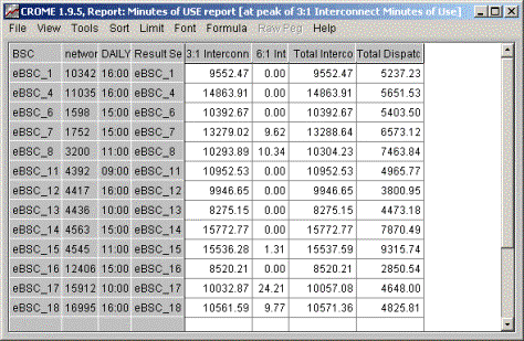
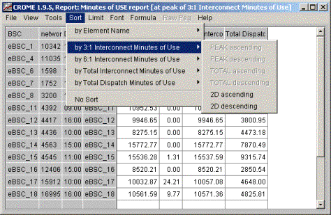
If you choose “Result Matrix 3D” from the Result Set pull-right, the Grid will appear as a standard Matrix Report as described in the section above on Matrix Reports (i.e., no bouncing busy hour on the fly). If you choose Result Peak Period 2D, this provides the “on the fly function”, namely: Show me a View By Element Grid such that each element’s result is based on upon the highest value for the specified function for the given period. As a specific example, if you choose the selection as shown above: Display a Result Set Grid based upon a bouncing busy hour on the fly for 3:1 Interconnect Minutes of Use, you will see a grid like:
This is a “bouncing busy hour on the fly” based upon 3:1 Interconnect Minutes of Use. Although data was initially queried for the entire day, this report only shows the information for the hour that was busiest for this element based upon 3:1 Interconnect Minutes of Use (e.g., hour 16:00 was used for eBSC_1 because 9552.47 was its highest 3:1 value for that day, whereas hour 11:00 was used for eBSC_8 because 10293.89 was its highest 3:1 value for that day. You’ll notice that the title bar for the window has changed to indicate “[at peak 3:1 Interconnect Minutes of Use]”. This example shows viewing the Result Set by any peak period – you could view the Raw Data Set based upon any peak in the Raw Data pegs (in the same manner, but choosing “View – Raw Data Set” instead of “View – Result Set”. Since you can create any report with any set of formulas, no matter how complicated, you can thus create a busy hour on the fly based upon any formula. Note that this concept is not limited to “hours” – it is the peak period which could any granularity depending upon how you ran the report. Sorting for Bouncing Busy Hour On the FlyAs noted above in the section on Matrix Reports, there are four different ways to sort a given formula within a matrix report: Peak ascending, Pak descending, Total ascending, and Total descending:
But if you change the view of a Matrix Report to a bouncing busy hour on the fly (i.e., choose View, Result Set, Result Peak Period 2D, and then choose a formula), the Sort menu changes:
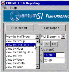
The Peak and Total ascending/descending menus no longer make sense in this view. Instead, the sorting is simply ascending and descending in this 2D view. View by Sliding HourOne of the most powerful ways to use the Busy Hour on the Fly feature is to View the data by Sliding Hour. In the above example, the main screen was set to View by Hour, so that each bouncing busy hour represented a 60 minute period that begins on an hour boundary. But by choosing View by Sliding Hour on the main screen:
Then the bouncing busy hour represents a 60 minute period that can begin on any hour or half-hour boundary. View by Sliding Hour is essentially a View by Half Hour where each Half Hour represents 60 minutes worth of data starting on that half hour. This is less useful for standard (non-Matrix, non-busy-hour-on-the-fly) reporting (as it would simply show double the data, since each half hour would represent 60 minutes of data), but it is very useful for busy-hour-on-the-fly. Using View by Sliding Hour, you can now report based upon the true busiest 60 minute period. |
| Report Export Functions | Top |
|
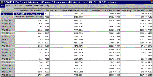
After the applying the various query features, you can export the report to Excel, which would allow you more flexibility in manipulating the report's appearance. Here we've chosen the Minutes of Use report with the following conditions to export to Excel: EBTS Network level, View by Hour , Date range: 7/1/97 00:00 to 7/2/97 23:59
The threshold and limit features are applied to the Result set grid so that we can easily view the data of interest. Now we'll export to Excel and further customize our report.
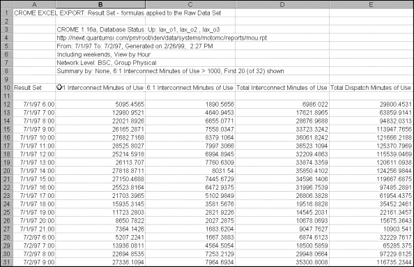
The conditions and filters set in the grid are noted at the top of the spreadsheet and the data is reflected in Excel the same as in the grid. Sometimes pictures are worth a thousand words. You can execute a predefined macro (after the macro has been installed) to automatically generate a graph of the data. Simply press Ctrl G (G for graph) while the cursor is on the active Excel spreadsheet and a graph will be generated and inserted into the Excel spreadsheet. You can also create your own graphs and format the spreadsheet according to your needs.
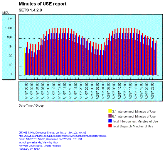
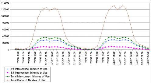
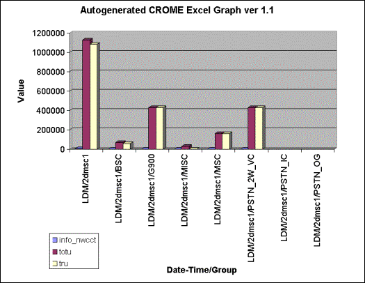
The graph below was created and formatted by manually selecting data and invoking Excel's graph .
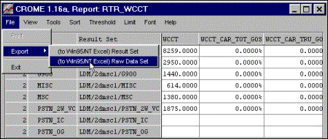
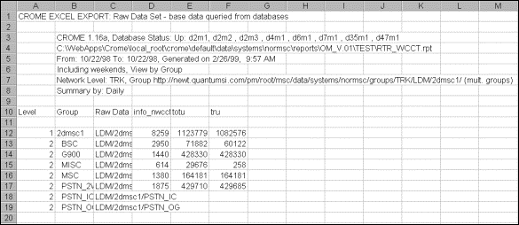
Another example shows the RTR_WCCT report with the following conditions to export to Excel: TRK Network Level, View by Group, Date range: 10/22/98 to 10/22/98, Summed daily.
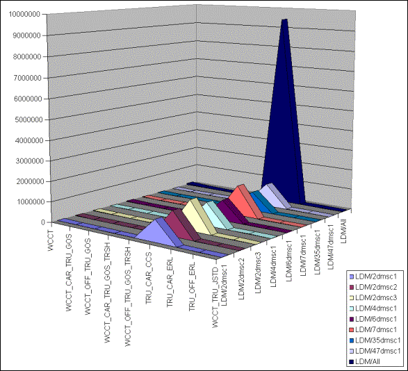
In this example we generate a 3-D graph simply by pressing Ctrl G (after the macro has been installed) in the active Excel spreadsheet.
Once your data has been exported to Excel you can use your companies standard office tools to prepare and present graphs with many more visual effects such as 3D bar or pie charts, etc.. Exporting your data is a simple and an excellent solution for presentations. However, combining CROME's interactive features with your graphical presentation provides you with a powerful and impressive method to convey and analyze your data.
For WEB based presentation your administrator can set up CROME to automatically generate GIF images (i.e. the same graphic as displayed in the report editor) into public areas on your company's WWW server. Refer to the WPM2/CROME Administrator’s Guide for details. |
| Contents | 1 | 2 | 3 | 4 | 5 | 6 | 7 | 8 | 9 | 10 | 11 | 12 | 13 | 14 | 15 | 16 | 17 | 18 | 19 | 20 | 21 | 22 | Previous | Next |
| Copyright © 1997-2005 Quantum Systems Integrators | Last modified: 30 Jun 2005 00:19 Authored by qmanual |