| Contents | 1 | 2 | 3 | 4 | 5 | 6 | 7 | 8 | 9 | 10 | 11 | 12 | 13 | 14 | 15 | 16 | 17 | 18 | 19 | 20 | 21 | 22 | Previous | Next |
| 10. Geographic Reporting |
| How Do I Create a Geo Report | Top |
|
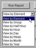
To create a Geo Report, you must first run a standard CROME report. First, make sure you are reporting on an OMC tree. Then you must run the report as a View by Element Report: You must run the report as a VIEW BY ELEMENT report:
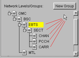
and you must run the reporting at the EBTS level or below (i.e., a Physical Layer of EBTS, SECT, CHAN, PCCH, or CARR, or a Group of elements at one of these levels).
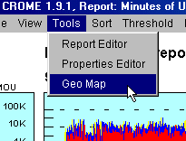
Once the report is run, choose: Tools, Geo Map:
|
| The Geo Reporting Window | Top |
|
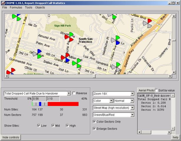
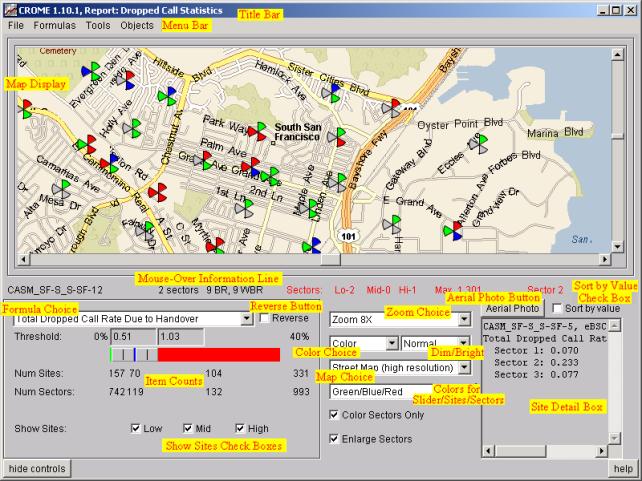
A new Geo Reporting Window will appear that will allow you to analyze the CROME report using site locations and geographical data. There are many components to the window, and each are highlighted in the picture below:
|
| Title Bar | Top |
|
The Title Bar displays the CROME version, followed by the name of the CROME Report used to generate this Geo Report. |
| Map Display | Top |
|
The Map Display depicts a map of the region of interest and each Site that resulted from the CROME Report Run. The Map always first appears centered on the sites in the report. To re-center the map at a new location, double click on the map. To pan to a new location, you can use the scrollbars below and to the right of the map. To zoom in or out, use the Zoom choice below the map. More information below discusses how to change to different maps (e.g., Street vs. Topo), and how to dim, brighten, or change the map to black and white. Sites on the MapAll sites are depicted using a three-pie-wedge symbol, representing the three potential sectors in a site. (Note, if you uncheck the Enlarge Sectors checkbox, the sites will be displayed as smaller circles). The color of the site depends upon the values of this item for the formula selected in relation to the thresholds selected. For example, a site may be colored red if its value is above a certain threshold, and green if it is below it. In particular, sites can appear the following ways with the following meaning. First, sites appear slightly differently if the CROME report was run at the Site level (e.g., BTS/EBTS, instead of a lower level like Sector or Carrier). How Sites Appear On Map When Running at BTS/EBTS Level:
Note that the color Blue was used for the above example, but it can be any color depending upon the value of this site for the given formula in comparison to the thresholds. However, the color gray is always used to represent "no sector" -- the color gray is never used to represent a formula value. Also, the Geo Report has a check box for "Color Sectors Only" (see below). If this is checked OFF, then the site will always be fully colored (like the 3 sector site example above). How Sites Appear On Map When Running Below Site Level (e.g., SECT, CARR, PCCH, CHAN).
As shown in the above examples, the Upper Right sector is always Sector 1, the Bottom sector is Sector 2, and the Upper Left sector is Sector 3. The Sectors are not pointed according to their RF Direction -- they are simply representative of Sectors numbers 1, 2, and 3 by showing the sectors respectively in the upper right, bottom, and upper left section of the site. Again, the color in the above example is Green, but it can be any color based upon the Sector value in the given formula and how that value relates to the thresholds. The user can set two different thresholds via the Slider Bar (see below), thus creating three different categories of values (below the first threshold, between the two thresholds, and above the second threshold). For example, let's say Green is below the first threshold, Blue is between the two thresholds, and Red is above the second threshold. If the map has a site that looks like this:
then the values of the sectors for this formula are such that Sector 1 (upper right) is between the two thresholds (blue), Sector 2 (bottom right) is above the second threshold (red), and Sector 3 (left) is below the first threshold (green). Note that sites with only 1 sector or only 2 sectors will "gray" for the missing sectors. Gray is never used to represent the value of a formula, it always means "no sector". For example, the following site:
has Sector 1 (upper right) and Sector 2 (lower right) both red (above threshold), but it has no Sector 3 (it is gray). The Geo Report has a check box for "Color Sectors Only" (see below). If this is checked OFF, then the site will always be fully colored and will assume the color of the highest threshold value. So, for example, if you have the following site:
and then you UNcheck the "Color Sectors Only" check box, the site will change to:
because red was the highest threshold (i.e., this "site" is above the threshold because at least one sector is above the threshold). The Geo Report also has a check box for "Reverse" (see below), which is used when the threshold is meant to detect low values instead of high values (a good example is Carrier Low INI). When "Reverse" is checked, and Color Sectors Only is unchecked, then the site assumes the color of that represents the lowest value (i.e., the site is below the threshold because at least one sector is below the threshold). |
| Mouse-Over Information Line | Top |
|
The "Mouse-Over Information Line" shows information about a site when the mouse passes over that site. It shows the site name, the number of sectors, the number of BRs and number of Working BRs. If the report is run at the EBTS level, the only other item of information on this line is the value of this site for the specified formula. If run at a lower level, you will see more detailed information about the values of the elements within this EBTS. For example, if the report is run at the Sector level, you will see something like: Sectors: Lo-1 Mid-1 Hi-1 Max 9677.874 Sector 3 Which means that for this Site, there was one sector "Lo" below the first threshold, one sector "Mid" in between the two thresholds, and one sector "Hi" above the second threshold. The highest valued sector for this formula is Sector 3, whose value is 9677.874. Similarly, if run at levels lower than Sector, you will see for example the number of Carriers Lo, Mid, and Hi, and the max Carrier and the Sector to which it belongs. The "Reverse" check box (see below) reverses the polarity to search for items below a threshold instead of a above. If Reverse is checked, then the Mouse-Over Information line will show the "Min" value instead of the "Max" value. |
| Formula Choice | Top |
|
The Formula Choice performs the same function as "Formulas" Menu Choice at the top of the window. It changes the Geo Report to display information for a different Formula from the CROME report. |
| Reverse Button | Top |
|
By default, thresholds are used to isolate high values. When unchecked, the Slider Bar (described below) slides from low to high values. When checked, it slides from high to low. If the Reverse Button is unchecked, and if the "Color Sectors Only" check box is unchecked, then sites will be colored according the maximum sector value. If Reverse Button is checked, then sites will be colored according the minimum sector value. The Reverse Button is positioned next to the Formula Choice because it is really associated with the Formula. You'll note that if you change formulas, the status of the Reverse button will stay associated with the formula. For example, if you check the reverse button for Formula A, then switch to Formula B, the Reverse Button will be unchecked, but if you switch back to Formula A, it will be checked again. The Reverse button is used in cases where it is desirable to isolate low values. A good example is the CROME System Report "Carrier Low INI". In this report, the "worst INI" value is meant to discover low values, so the Reverse button is applicable. In fact, CROME will automatically default the Reverse button to the "checked" state if the formula in question has a default threshold that is set to find values below the given threshold (as opposed to above the given threshold). |
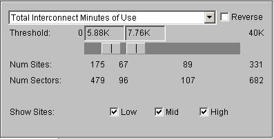
| Slider Bar | Top |
|
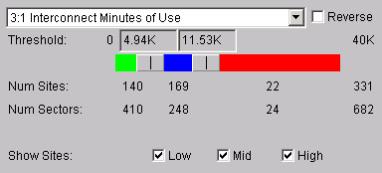
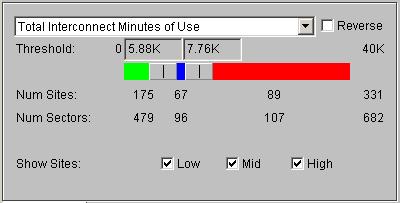
The Slider Bar is a powerful means to analyze the CROME Geo Report data. It contains two "threshold" Slider Handles, which can be used to isolate the site and sectors on the map into three categories (low, middle, and high). If the two handles are position adjacent to each other, then of course there is no "middle" and the sites will be isolated into low or high.
To user the Slider Bar, simply click and hold one of the Slider Handles and drag the handle left or right. You'll note that as you drag the left handle to the right and come up against the right handle, both handles will begin to slide. Similarly, you can slide the right handle to the left and up against the left handle to begin dragging both at once. You can also click on the numbers above the slider bar and type in values to get a more exact result. As you drag the handle, you'll notice the numbers below change (See "Item Counts" below). This shows the number of sites, sectors, carriers, etc. that are in each "group". When you let go of the mouse, the Map Display will update based upon the new threshold values. All site and sectors can potentially change color (or possibly disappear -- See "Show Sites Check Boxes" below) after the mouse is let go. The Slider Bar has a minimum and maximum value (in the picture above: 0 and 40K) that is determined based upon the minimum and maximum values of the elements in the report for this formula. And if the Reverse Button is checked, the minimum and maximum values are reversed. |
| Item Counts | Top |
|
As you drag the handles on the Slider Bar, the Item Counts below it update. If this report was run at the EBTS level, then only "Num Sites" will show. If run at the SECT level, then "Num Sites" and "Num Sectors" will show. And if run below the SECT level, the number of lower elements (e.g., Carriers, Channels, or PCCH) will also appear. The value is calculated based upon the number of elements in each threshold range. For example, the picture above is a Sector-level report. Based on the two thresholds (3.7K and 7.3K for 3:1 Minutes of Use), there are 2678 sectors whose value is at or below 3.7K, 1319 sectors above 3.7K but at or below 7.3K, and 437 sectors above 7.3K). The Num Site counts are based upon maximum values of the sectors within those sites. So, in this example, there are 356 sites that have at least one sector above 7.3K, 679 sites that have at least one sectors above 3.7K but no sectors above 7.3K, and 732 sites that have no sectors above 3.7K You'll note that if you click the "Reverse" button in this scenario, the number of sectors within each category will flip but remain constant (e.g., there are still 2678 sectors below 3.7K, which would now become the "high" "red" section). But the number of sites in the "high" "red" section can change, because now the number is calculated based on the number of sites where at least one sector is below a given threshold, not above. The total number of sectors and total number of sites and sectors (1732 and 4434 in this example) will of course always the same constant for a given report. |
| Show Sites Check Boxes | Top |
|
The "Low", "Mid" and "High" check boxes are checked "on" by default. If you uncheck one of these, all of the sites in this category will disappear from the map. This is useful when trying to isolate problem sites. I.e., you can drag the Slider Bar handle to a desired location and exclude from the map all sites below or above that threshold. |
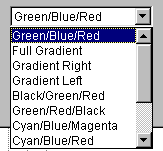
| Colors for Slider/Sites/Sectors | Top |
|
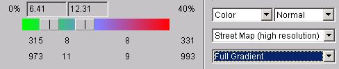
So far in this document the examples have centered a round the default site coloring scheme: green below the first threshold, blue between thresholds, and red above the second threshold. By changing this item, you tailor the colors many different ways Of interesting note are the "gradient" choices. These are useful for getting a "big picture" view of a large number of sites and seeing, in generally relative terms, the extent of which areas on the map contain "good" and "bad" sites. A selection of "Full Gradient" will not separate colors based up the Slider Bar, but simply spread the color spectrum evenly and linearly across the possible formula values:
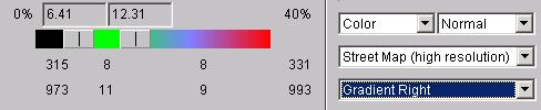
When viewing Full Gradient, the Slider Bars will have no effect on the colors of the sites and sectors on the map (but the Slider Bar still may cause sites to appear or disappear from the map if any of the "Show Sites" check boxes are unchecked). The Gradient Right Choice:
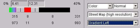
allows you to adjust the second Slider Bar Handle to form a group of sites near the top of the threshold and view them in a gradient fashion. The middle section becomes Green (bottom of the gradient spectrum) and the lowest section is black (off the spectrum). Similarly, the Gradient Left Choice:
shows the lower section as a gradient, the middle section as red (top of the gradient spectrum) and the highest section as black (off the spectrum). |
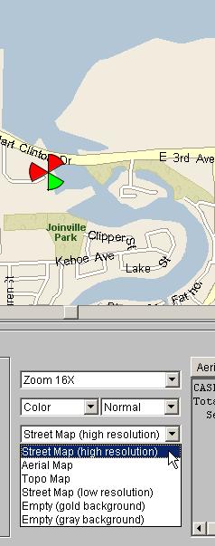
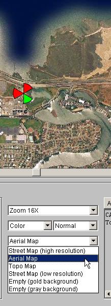
| Map Choice – Street Map, Aerial, etc. | Top |
|
CROME’s map support almost any arbitrary base map. The CROME System is by default configured with base street map, but other maps can be purchased from various suppliers (or from the client), and provided its format is supported and can be converted into a CROME map (usually the case), the map can be used. To switch between different maps, select the map choice and change it:
|
| Color Sectors Only Check Box | Top |
|
The Check Box alters the way sites are displayed on the map. When running a report at the EBTS level, and when this Check Box is On, the "threshold color" will only color a percentage of that site based upon the number of sectors in that site. So, if a site has 2 sectors instead of the max 3, only two thirds of the site will be colored and the other third will appear gray. When this is checked Off, the entire site will be colored according to this threshold color. When running a report below the EBTS level (e.g., SECT, CARR, PCCH, or CHAN), and this Check Box is On, then each individual sector within the site will be colored according to its threshold value color. See the section above on Map Display for a description on how each sector is colored. When this Check Box is Off, the entire site will always be one color, equal to the color that the highest-value sector would be colored if this Check Box was off (or, when the "Reverse" Check Box is checked, the lowest-value sector). |
| Site Detail Box | Top |
|
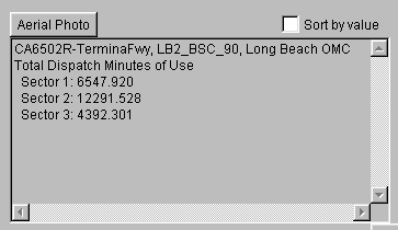
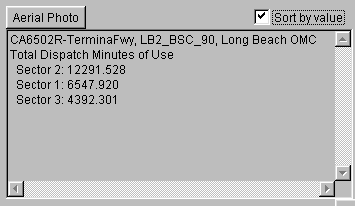
When a site is "clicked" on the map, the Site Detail Box is filled in with the following information: Site Name, the BSC to which this site belongs, and the OMC. The name of the current Formula being analyzed. The numeric value or values (depending upon the level of the report). I.e., if this is a EBTS level report, then the one value for this EBTS for this formula will be shown. If this is a Sector report, then each Sector's value will be shown. |
| Sort by Value Check Box | Top |
|
When the Sort by Value Check Box is Off, the Sectors (or Carriers, etc.) in the Detail box are ordered by name (e.g., Sector 1, Sector 2, etc.). When the Sort by Value Check Box is On, the items are ordered by their corresponding formula value, sorted from highest to lowest, unless the "Reverse" Check Box in On, in which case they are sorted lowest to highest. |
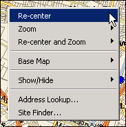
| Map Control | Top |
|
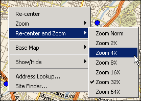
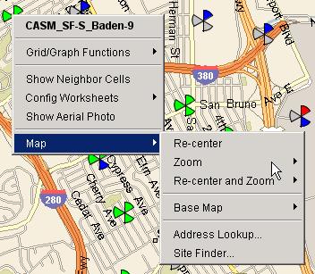
By clicking the right mouse button over any spot on the base map, you will see a "pop-up" menu with a number of features. Some of the features (Like Zoom Choice, Color Choice, Dim/Brightness Choice, and Map Choice) are also available as separate pull-down choices from the window. Re-centering the MapThe "recenter" feature performs the same function as double-clicking on the map -- it recenters the map to the clicked location:
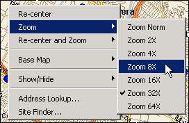
Zooming the MapThe "zoom" pop-up menu feature performs the same function as the "zoom" choice at the bottom of the screen -- it zooms the map in and out. Note that the current zoom level is marked as "checked" in the pulldown menu, e.g., in this example the current zoom level is "32x" but the user is changing it to "8x". Note that when the zoom is changed via this pop-up menu, the zoom choice at the bottom of the screen updates automatically.
Re-center and Zooming the Map at the same timeThe "Re-center and Zoom" features performs both re-centering and zoom-in at the same time, allowing you to quickly zoom in on a particular spot in the map (e.g., click on a site then, in one mouse click, recenter the map on that site and zoom in).
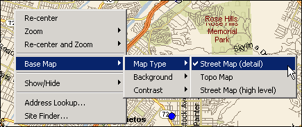
Map Background AdjustmentsThe "Base Map" menu provides the same functionality as the pull-down choices on the control panel at the bottom of the screen, namely the ability to change the look of the street map, switch the background to black/white or color, and switch the contrast to normal, bright, or dim: Note that when the map background is changed via this pop-up menu, the map choices at the bottom of the screen update automatically.
|
| Aerial Photos | Top |
|
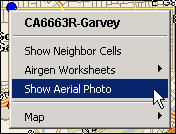
This feature is available either by clicking the right mouse button over a site:
or by clicking on the Aerial Photo button when a site has been selected.
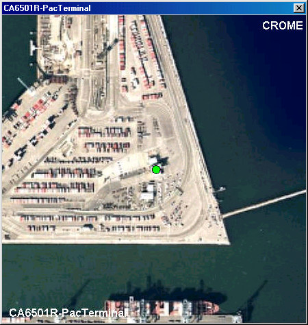
This will result in an overhead photo of the area where the site resides. A green filled circle shows the site location in the center of the picture. |
| Hide Controls Button | Top |
|
The Hide Controls Button simply hides all of the control function to view more of the map in the window. |
| Help Button | Top |
|
The Help Button brings up the webpage describing the functionality of the Geo Reporting tool. |
| File Menu – Exporting the Map Image | Top |
|
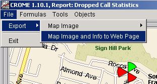
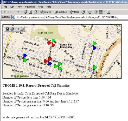
The Menu Bar contains four Menus: File, Formulas, Tools, and Objects. The File contains an "Exit" choice, which closes the window (but does not exit your CROME application). It also contains: From the File Menu you can export the Map image to either your local PC image viewer, or to a temporary webpage that will be created for you on the CROME web server. To export the image to the registered image viewer on your PC, choose File / Export / Map Image / Use current window size / to: Graphics Viewer. This will cause your PC graphics program to launch automatically and load the image from the map. If you choose File / Export / Map Image and info to Web page, and temporary web page will be created on the CROME web server.
The image will be uploaded to the web server, along with information about this report:
|
| Formulas Menu | Top |
|
The "Formulas" menu allows you to choose between the different formulas that were defined in this CROME report. The Geo Reporting Tool displays results for one formula at a time. The Formula can also be switched using the Formula Choice (see above). |
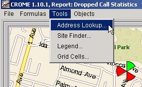
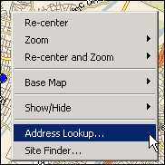
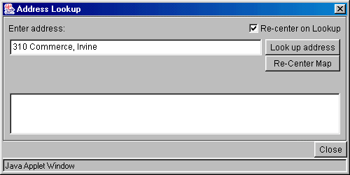
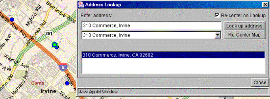
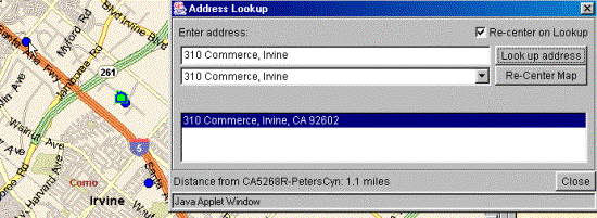
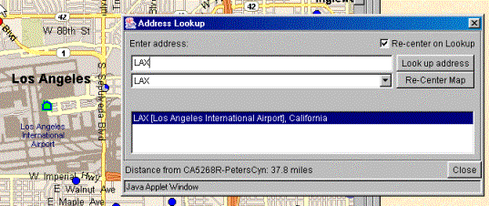
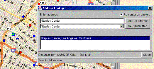
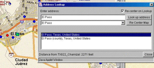
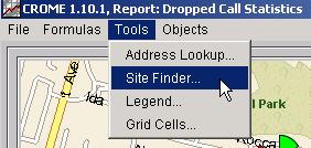
| Tools Menu -- Address Lookup | Top |
| Tools Menu -- Site Finder | Top |
|
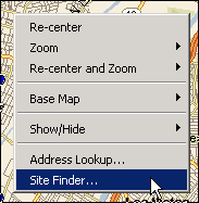
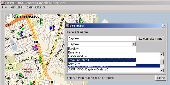
This Geo Map feature provides the ability to find sites on the map based upon the site name. Site Finder is available either from the Tools menu:
or by clicking the right mouse button over the map and choosing:
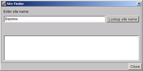
If you've read the information about the Address Lookup feature above, you'll note that the Site Finder feature operates in a very similar manner. In the box underneath "Enter site name", enter any portion of the site's name. In this example, we'll just enter the word Bayview:
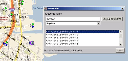
Note that the search is case-insensitive, so "bayview" or "BAYVIEW" would return the same result. In the list at the bottom of the window we see that a number of sites contain the word Bayview. The first site by default is selected, so this site becomes "highlighted" on the map with a purple ring around the site image. Also, because the "Re-center on Lookup" checkbox is checked ON, the map has automatically recentered to the site location. If the "Re-center on Lookup" checkbox is OFF, the map will not automatically re-center. However, you can re-center the map on the selected site at any time by clicking on the "Re-Center Map" button. (Note that re-centering does not change the zoom level, just the map location).
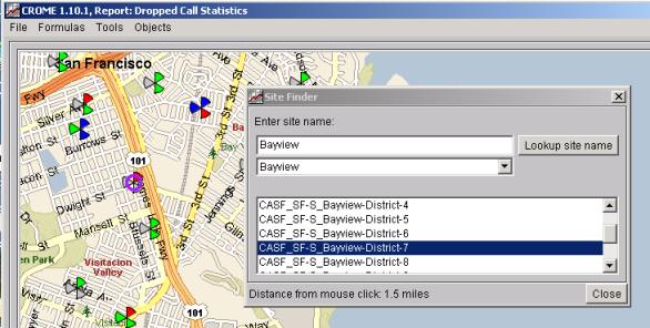
If you click a different site in the list, then the new site will be highlighted and (if the Re-center on Lookup checkbox is ON) the map will re-center to the new site.
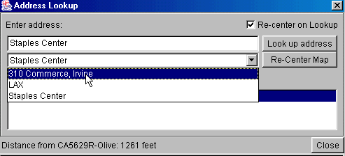
Like the Address Lookup feature, previously typed-in sites will be added to the pull-down list such that you can easily bounce back and forth between previous entries:
Also, like the Address lookup feature, if you click anywhere on the map, the Site Finder window will show how many miles the selected site is from the clicked location. (If the distance is less than one mile, the distance is shown in feet). Note that the looked-up site may be invisible on the map at the time it is being searched. This is because, for example, the Real Time Variance Geo Map display allows you to "make invisible" sites that are in or out of variance, and also the CROME Geo Reporting feature allows you to hide sites that are below or above a given threshold for a given formula. In these cases, the site can still be found and the purple ring will still be shown on the map, but the site will still remain invisible. |
| Tools Menu -- Show Legend | Top |
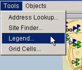
Standard LegendTo show a legend on the map, choose Legend from the Tools Menu:
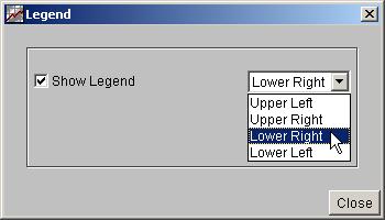
This will bring up a pop-up window that allows you to turn on or off the legend, and to place it on one of the four corners of the map:
When you click ON the “Show Legend” checkbox, you will see a legend appear on the map:
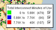
The legend shows three lines, one for each of the three sections of the Slider Bar on the map controls. Each line shows the range of values and the number of items in each range. Note that the count is for the number of items reported on, which is not necessarily the number of sites. If you run the report at a site level, then the count represents the number of sites. If you run it at the sector level, it represents the number of sectors, etc. As you adjust the Slider Bar, you will see that the range values and count values on the legend adjust as well:
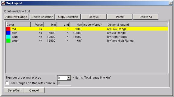
Each line of the legend box has a “checkbox” which shows/hides the sites for each group. If reporting on network levels lower than site, e.g., sector, then the map will display any site that has at least one sector in a “checked on” line. This works the same as the “Low”, “Mid”, and “High” checkboxes on the map controls. Custom LegendWhen creating a report, you can define a Custom Legend. The Report Editor section of the user’s guide gives an example of how to create a custom legend for a report. For example, the custom legend definition from the Report Editor looks like:
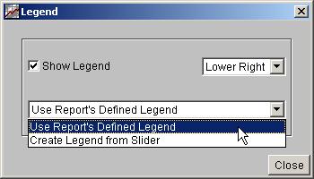
Custom legends are associated with formulas in the report, and each formula can have a different custom legend. If you have selected a formula on the GeoMap for which this report has a custom legend, then when selecting Tools / Legend you will see an additional choice in the Legend pop-up window:
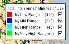
You can choose to use the legend as defined in the report, or you use the legend as shown above (i.e., three lines associated with the Slider Bar). If you choose to use the report’s legend, using the example above, the legend on the map would look like:
When using a custom legend, the Slider Bar now has no effect on the information in the legend, nor for that matter any effect on the colors of the sites and sectors. For that reason, the Slider Bar turns gray when showing a custom legend: The Slider Bar turns gray to make it clear that the colors of the sites and sectors are now associated with the ranges of the defined custom legend, not the Slider Bar. |
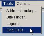
| Tools Menu – Grid Cells | Top |
|
The Grid Cells feature allows you to group items into user-defined rectangular areas to see information based on those groupings. To enable this feature, choose Grid Cells from the Tools Menu:
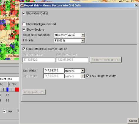
This will bring up the “Report Grid” window. If you check ON the “Show Grid Cells” checkbox, you will see something like this:
You’ll notice that the map now has a series of Grid Cells of different colors. These colors represent the aggregate value of the sites/sectors in that cell, as defined by the information in this window. The following choices are available on the Report Grid Display: Show Grid Cells When checked on, it shows the Grid Cells and enables this feature. Show Background Grid When checked on, it shows a background grid, including “empty” grid cells for areas where there are no sites. When checked off, the map only shows grid cells that have sites in them. Show Sectors or Show
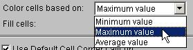
Sites Depending on the network level of the report generated, this checkbox will show “Show Sectors”, “Show Sites”, etc. When checked off, only the grid cells are shown on the map, not the sites/sectors. Color Cells Based On This defines how each grid is colored:
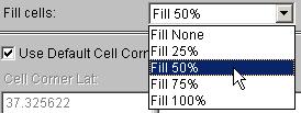
Minimum Value: Color the grid cell based upon the minimum value of all sites/sectors in this cell Maximum Value: Color the grid cell based upon the maximum value of all sites/sectors in this cell Average Value: Color the grid cell based upon the average value of all sites/sectors in this cell Fill cells Allows you to set the amount of fill in each cell:
If “Fill None” is chosen, then an empty box is drawn for each grid cell (in the appropriate color). If Fill 100% is chosen, then a solid colored box is shown. Use Default Cell Corner
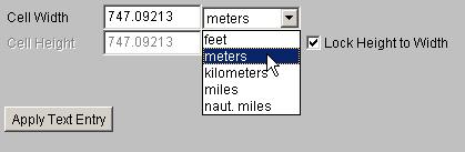
Lat Lon When Use Default Cell Corner Lat Lon is checked on, the software automatically picks a starting point for the entire grid (based upon the most north/west site on the map). The display gives you the option to move this starting point, if desired. By moving the starting point of the grid, you can change which sites appear in which grid cells. To change the starting point, uncheck the Use Default Cell Corner Lat/Lon checkbox, and either enter a latitude longitude by hand or simply click on the map then click the button that says “Fill from last Map Click”. This will shift the entire grid accordingly. Cell Width and Height The software will automatically pick a default width/height for the grid cells, based upon examination of the data. You can changes this size by entering a new Cell Width value, and clicking the Apply Text Entry button. You can also choose to have the number represented as feet, meters, kilometers, miles, or nautical miles:
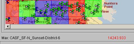
If the “Lock Height to Width” button is checked, then the grid cells are guaranteed to be square in shape, with the height always equaling the entered width. If you uncheck this choice, then you can enter separate width and height value and create rectangular grid cells. Geo Map Mouse Over and Detail Box Note that when using Grid Cells, the “mouse over” and “detail box” on the Geo Map control panel provides some new features. When you mouse over or click on a site, the same information as before is shown (values for this site). But if you mouse over a grid cell section where this is no site underneath the mouse, or if you click no a grid cell at a location where there is no site, the information you see will reflect the values for this entire grid cell. For example, when viewing the maximum value for each cell, if you mouse over the grid cell you will see the maximum value and which item within the cell generated that maximum value:
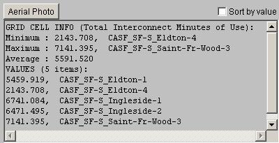
If you click on the grid cell, the Detail Box will show the minimum/maximum/average values, which item contributed to the minimum and maximum, and the values of each item in the grid cell:
|
| Objects Menu | Top |
|
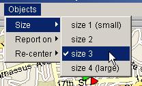
The Objects Menu allows you to adjust the size of sites/sectors on the map, re-center the map based on data from the report, and also modify how report limits/thresholds affects which items are displayed on the map: Objects SizeThis allows you to modify the default size of each site in relation to the map:
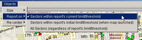
Objects – Report OnThe “Report On” choice alters how this map represents the data when the report has a “limit” or a “threshold” applied. As discussed in the Report Items section of this document, Thresholds change which sites/sectors are included the report based upon which items are within the given threshold. Limits change which sites/sectors are included based on, e.g., “Limit to show just the first 50 sites based on my given Sort”. By default, the Map always reflects what is on the report. I.e., if you apply a threshold in your report item, resulting in a reduction of sites from, say, 200 down to 10, then the map will change to reflect this, hiding 190 of the sites and only showing the 10 that meet the threshold. You can change this behavior via the “Report on” choice:
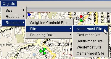
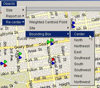
“Sectors within report’s current limit/threshold” (note this could be “Sites”, “Carriers”, etc.) is the default choice, as described above. If you choose the second choice, “within report’s initial limit/threshold (when map launched), then the map will always reflect the sites/sectors/etc. based upon the original limit and threshold that was present in the report item when the map was launched. If you pick the third choice “All Sectors (regardless of report’s limit/threshold)” then the map will always show all sites/sectors/etc., regardless of any changes (or original settings) of the report item’s Limit and Threshold values. Objects – Re-centerThis menu allows you to re-center the map based upon the data in the report. You can choose to re-center based upon a weighted centroid point, the north-most site (or east-most, south-most, west-most, or center most), or at a location based upon the bounding box of all sites:
|
| Site Information – Right Mouse Click on Site | Top |
|
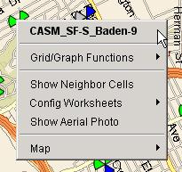
If you click the right mouse button over a site on the map, you will see a Site Information pop-up menu.
The Site Name is shown in bold at the top of the menu. The menu includes the ability to show neighbor cells, configuration worksheets, and aerial photo. Details of each of these features described below. Note that at the bottom of the Site Information pop-up menu, there is a "Map" menu. This is the same Map menu that appears if you click the right mouse button over the base map. This way, you can click on a site and either view site information or, for example, by moving down to the "Map" menu, re-center on the site and zoom in.
|
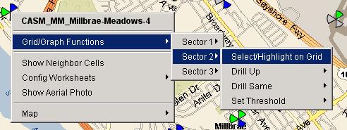
| Grid/Graph Functions | Top |
|
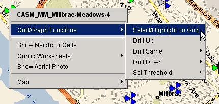
The Grid/Graph Functions provides some features related to the Report Item that launched the map. First, it allows you to highlight the row on the CROME Grid that corresponds to the site selected. Second, the Grid/Graph Functions menu provides some of the same choices available when right-mouse-clicking on the same item on the Graph or Grid. For example, if you run a report at the Site (EBTS/BTS) level, you will see this
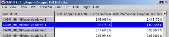
Choosing “Select/Highlight on Grid” will highlight at row in the Grid:
The “Drill Up, Drill Same, Drill Down, and Set Threshold Features work exactly the same as if you had right-mouse clicked on this item in the Grid. For details on these features, see the Report Items Section (subsections on Drill Menu and Drill Pop-Ups Set Threshold Pop-up) Note that when you a run a GeoMap at the Sector Level, or levels below Sector such as Carrier, the choices are split between the different items:
|
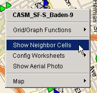
| Neighbor Cells | Top |
|
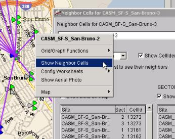
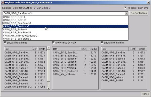
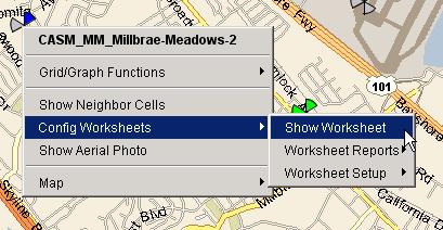
Clicking the right mouse button over any site on the map and choosing "Show Neighbor Cells" launches a powerful feature to analyze the "neighbors" of sectors within the site.
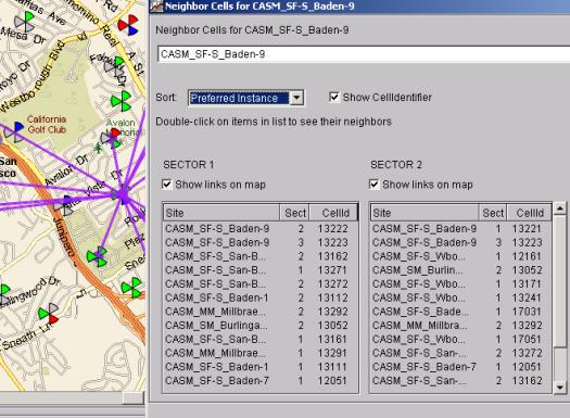
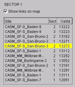
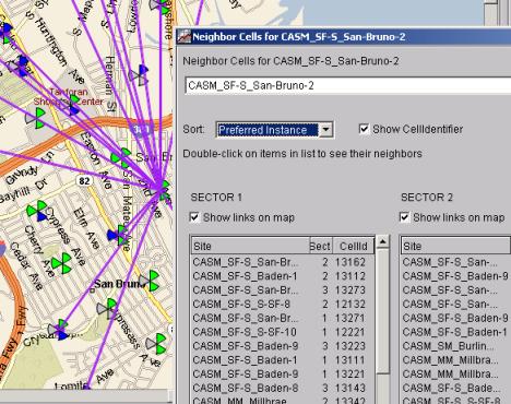
A "Neighbor Cell Window" will appear, showing the site name and, for each sector in the site, a list of each site/sector that is configured as a "neighbor" for the sector: Note in the picture below that purple lines appear on the map. These lines link the site (in the center) with all of its neighbor sites.
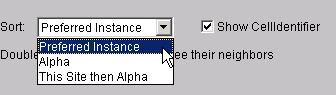
The Neighbor Cell Window contains, underneath the words SECTOR 1, SECTOR 2, and SECTOR 3, "check-boxes" labeled "Show links on map". If you un-check any of these boxes, the purple lines on the screen which represent links for that sector will disappear on the map (and of course re-appear when you check the box back "on"). This window shows, for each sector, the list of “neighbors” identified by Site Name, Sector, and Cell Identifier (you can disable view of the CellID, by un-checking the Show Cell Identifier checkbox. By default, the neighbors in the display are sorted by their Preferred Instanced as defined in the site’s configuration. You can resort this via the pull down choice:
“Alpha” sort all of the neighbors alphabetically (Site name then sector #), and “This Site then Alpha”, shows this sites own sectors at the top and then sorts the rest alphabetically. There are three ways to switch the Neighbor Cell Window to view a different site. One way, as shown here:
is to double-click on any of the sites/sectors listed in the window. This will cause the Neighbor Cell Window to load and display the neighbors for the selected site, and consequently the "purple lines" will shift to the new site. The second way to view a different site, as shown below, is (as before) simply click the right-mouse button on a different site and choose "Show Neighbor Cells".
Which causes the Neighbor Cell Window to change and the purple lines to refocus on the new site, resulting in the picture below:
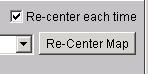
The Neighbor Cell Window contains a button labeled "Re-Center Map". Clicking this button will cause the map to recenter on the site shown in this window. There is also a check-box labeled "Re-center each time". When checked ON, the map will automatically re-center every time a new site is displayed in this window:
The Neighbor Cell Window also contains, as shown below, a pull-down choice of all previous sites that have been displayed in the Neighbor Cell Window since the map was first brought up. This is the third way to switch the window to a different site. You can always "jump back" to a previously displayed site by finding it in this list:
|
| Site Configuration Worksheets | Top |
|
The "Show Worksheet" menu choice:
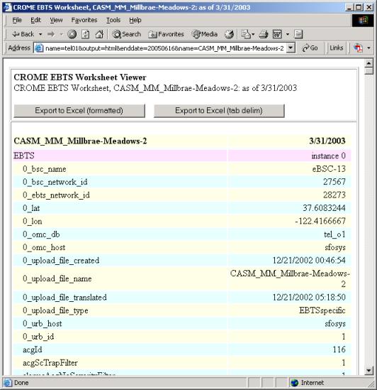
This launches a new web browser page which contains the current “Worksheet” for this site, i.e., how the site is configured. The web page contains all parameters, plus a number of synthetic parameters created in CROME (these parameters all begin with "0_" and contains useful information like BSC name, Lat/Lon, etc.). A sample web page is shown below. This picture only shows the top of the scrolled page -- there is much more below on the actual page. Note that "EBTS" is highlighted, as are all sub "elements" further down the page (e.g., CELL, CARR, BR, NEIG, etc.) so that it is clear which parameters belong to which level.
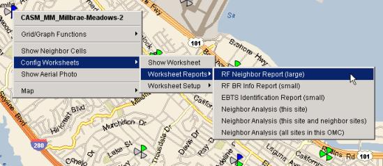
Since the Worksheets are quite long, custom "reports" can be very quickly created to show useful subsets of the data, making it easier to quickly get the desired information. Three of these custom reports have already been created, which are listed under the menu item "Worksheet Reports":
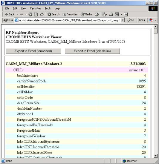
The "RF Neighbor Report" isolates pertinent information about the CELLS and their neighbors. "RF BR Info Report" focuses on base radios, and "EBTS Identification Report" gives all of the CROME-created synthetic parameters, as well as some configuration parameters, that help identify this site. Below is an example of the "RF Neighbor Report" that appears in the web page (note again that most of the report is scrolled off the screen):
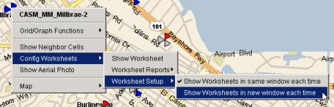
An even more powerful Neighbor report is the Neighbor Analysis Report. This report shows a table of each neighbor for each sector, along with reverse-neighbor lookup information. By default, all Worksheet and Worksheet reports re-use the same browser window. So, if you display one worksheet in a web page, and then decide to display another, the first worksheet will disappear from the web page and be replaced by the new worksheet. This functionality can be changed by using the "Worksheet Setup" menu off of the pop-up menu. If you check "Show Worksheets in new window each time", then a new browser "window" will appear every time a new Worksheet or Worksheet report is created. This is useful when you desire to compare Worksheets side-by-side:
|
| Contents | 1 | 2 | 3 | 4 | 5 | 6 | 7 | 8 | 9 | 10 | 11 | 12 | 13 | 14 | 15 | 16 | 17 | 18 | 19 | 20 | 21 | 22 | Previous | Next |
| Copyright © 1997-2005 Quantum Systems Integrators | Last modified: 30 Jun 2005 00:19 Authored by qmanual |