Big Data to Human Insight -or- The number 7 +/- 2
We have now entered the age of big data. Massive datasets are now
very common in science, government and enterprises. Yet, making sense
of this data still remains a fundamental challenge despite a
revolution in tools to store and manage these data sets.
Where do we start our analysis? Where to go next? How to visualize our findings? Even more important is the $10M question -- how do we make sense of our data/findings and act on them?
I thought I'd share this note I sent this week to Quantum's Staff, about the
mission goal that we need to instill in all our product lines:
New technology is worthless if it can't help people, by this I mean our clients and our clients' businesses.
_______________________________________________________________________________
Begin forwarded message:
| From: | Jon Strabala |
| Date: | March 26, 2014 10:07:02 AM PDT |
| To: | All Quantum Staff |
| Subject: | Big Data, Cool Tech, etc. still has to fit in the customer's head |
At QuantumSI we answer the questions posed above by bridging the two domains of Data Mining and Human Computer Interaction (HCI) to create tools for making sense of data, be it tables or graphs with millions or billions of elements or nodes and edges.
I named this blog "Big Data to Human Insight", but to drive home a point I also named it "The number 7 +/- 2". As bizarre as it sounds the number "7" is a very key number for mapping big data into insights (no I'm not talking MapReduce here).
Consider the average person can only keep 7 facts (plus or minus two) in their active working memory. Think of our cognitive ability as being modeled by a system with a CPU cache (just 7 fact objects), no RAM, and when we overflow we go to a low speed organic disk and swap a fact object. Yes it sounds cold and impersonal modeling people and thus our clients as poorly constructed computer systems, yet the analogy works.
Don't believe me look at psychology research like:
The Relationships Among Working Memory, Math Anxiety, and Performance or just do your own Google on "working memory" facts.
We as people and individuals are vastly different than machines and if software tools and application suites don't take this key fact into account entire product lines will fail.
So getting back to the main point we start with big data and its supporting ecosystem "Automatic", "Summarization", "Clustering", and "Millions Nodes+" yet in order to make sense of it we need to map it into something a person can interact with. Human Computer Interaction (HCI) is "User driven", "Iterative", and "Hundreds to a Thousands Nodes". A reduction from the big data domain to the HCI domain allows us to make sense of the data set at hand and act on it.
We all know this makes sense, it is simple to illustrate, consider the following set of data large multi-national data set:
	bts#	SECT	sect#	nid	BBH	Result Set	Total Erlangs

	72	72X	X	408	20:30	BTS 72,  72X	 8.1406
	72	72Y	Y	404	20:30	BTS 72,  72Y	29.4765
	72	72Z	Z	401	10:00	BTS 72,  72Z	16.4340
	42	42X	X	826	17:00	BTS 42,  42X	 5.9468
	42	42Y	Y	823	17:30	BTS 42,  42Y	 2.9758
	33	33X	X	512	16:30	BTS 33,  33X	 4.6818
	33	33Y	Y	509	20:30	BTS 33,  33Y	 4.4977
	    *
	    *
	    *
	    *
So we have almost a hundred thousand rows of data after it has been summarized (and that's just at the sector level) of data. Does it fit into anyone's head? Of course not.
So we make tools like a basic graph (below) for human computer interaction.
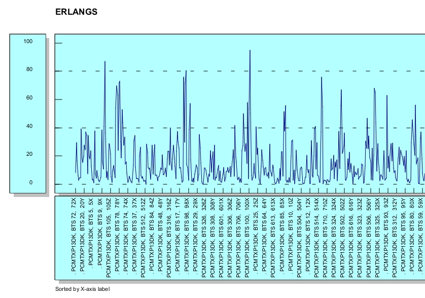
Obviously the first view (above) seems like so much noise, but adding a simple sort can help uncover patterns or bottlenecks (below) or sorted the other way resources that are not being used. The "value add' via the simple capability to sort shows the value in the iterative nature of HCI.
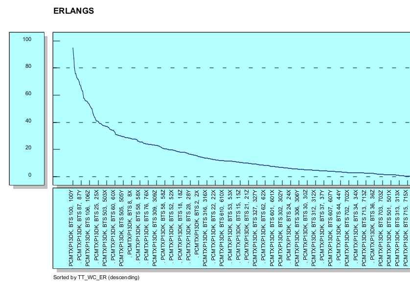
The second view (above) is great for either highly loaded or lightly loaded sectors but it might still be lacking, after all we talking about almost a hundred thousand sectors of data (were only showing the right most side of the graph). The goal of HCI is to allow the fact or facts to fit in our cognitive perception. There are lots of way to view aggregates or summaries (most people are stuck on using just bar, line, and pie charts), perhaps a better way to understand this data is to map a view on the data via a cumulative percentage graph.
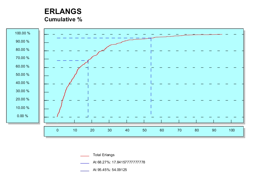
I leave it as an exercise to you the reader to imagine the value and utility of the above (hint think of what a 'sharp' or 'soft' knee in the graph means). Consider the utility of merely overlapping the same graph made in different months or in adjacent days around a key network configuration change.
The point that I am trying to beat into everyone is that for some domains the right HCI view, in this case a cumulative percentage graph, it is a perfect mapping of big data into our cognitive working set.
In technical terms cumulative percentage is another way of expressing frequency distribution. It calculates the percentage of the cumulative frequency within each interval, much as relative frequency distribution calculates the percentage of frequency. The main advantage of cumulative percentage over cumulative frequency as a measure of frequency distribution is that it provides an easier way to compare different sets of data. I not saying it's the right HCI view for everything but it is QuantumSI's job to match or create HCI views to the needs of our customers.
Even the fastest database on the planet that holds multiple zettabytes of data that doesn't have an easy to use and understand HCI view set to access the data in the enterprise essentially becomes a worthless locked door.

This is nothing new. We here at QuantumSI have done it time and time again, connecting data to the end user, in CROME, CCM, MCB, and other product lines.
But I want us all to think very hard before we try to hop on the next great thing or latest open source technology. At the end of the day we need to always ask ourselves will this "next innovation" really help our customer make sense of his data better and act on it faster and with more tangible results? Remember any one can store multiple terabytes it's getting the knowledge out and using it that matters.
Let's be sure we're there to create and add value and help make sense of the massive silos of data that we collect and manage - thus keeping the door open for customers to find value in their data.
Avoid jumping on the popularity contest bandwagen, take they hype surronding NOSQL and MapReduce with a grain of salt. Don't think that this only happens to us software developers or systems integrators, it happens in all industries and across carrers. Just consider the following:
Those lawyers put Penn State in the middle of the pack, even though every fact they thought they knew about Penn State's law school was an illusion, because in their minds Penn State is a middle-of-the-pack brand. (Penn State does have a law school today, by the way.) Sound judgments of educational quality [just like complex hardware or software systems] have to be based on specific, hard-to-observe features. But reputational ratings are simply inferences from broad, readily observable features of an institution's identity, such as its history, its prominence in the media, or the elegance of its architecture. They are prejudices. There is no substitute for actual experience in getting your hands ditry and working with a new unproven hardware product or software system and then not only testing it, but also testing it at scale with real customer data.
Jon A. Strabala.
Posted on March 26, 2014